2026-07-03

ProductRail - Overwatch dashboard for multiple product builders

I've built a lot of products over the years — apps, SaaS tools, AI experiments, side projects that turned into real things and side projects that stayed side projects. For a long time, that was fine. I could hold the whole picture in my head. Which domain pointed where, which repo needed a deploy, which app was waiting on App Store review.

Then I crossed somewhere around ten active products, and the picture stopped fitting in my head.

The problem with juggling too many products

Here's what nobody tells you about running multiple products as a solo founder or small team: the hard part isn't building them. It's the operational sprawl that comes after.
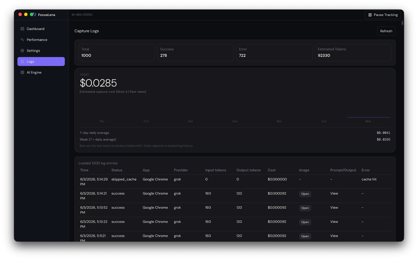
Each product needs:

  • A domain, properly configured and renewed
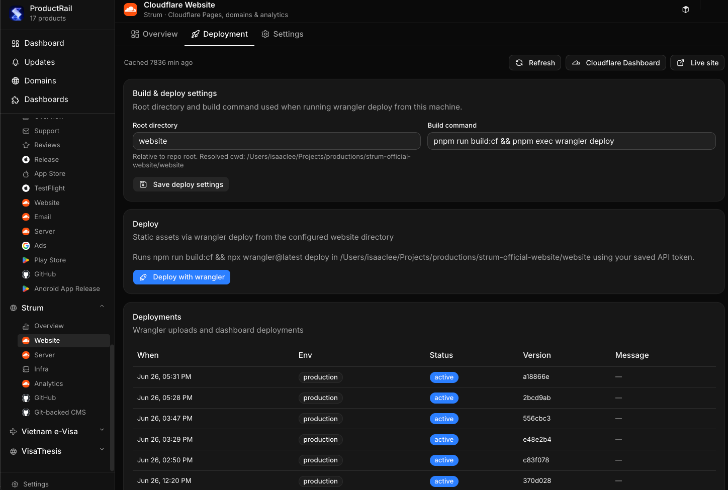
  • A build and deployment pipeline
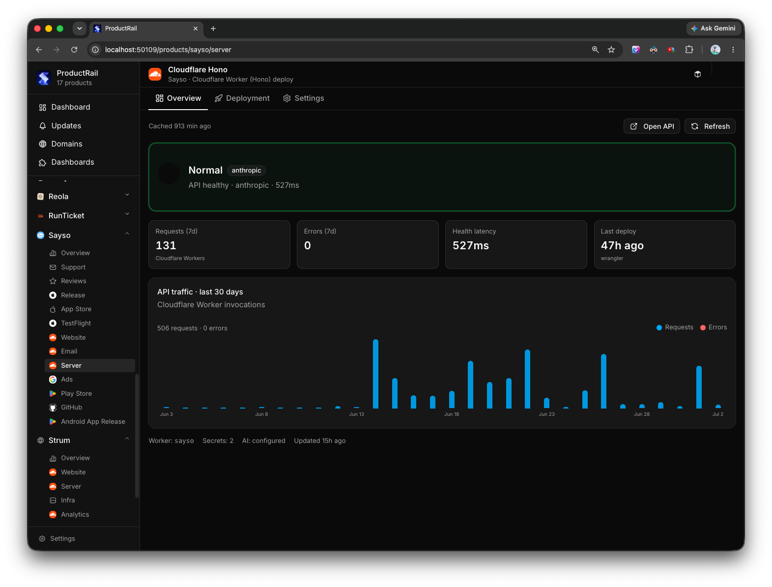
  • Visibility into backend health and uptime
  • Analytics you actually check
  • A marketing site that doesn't rot
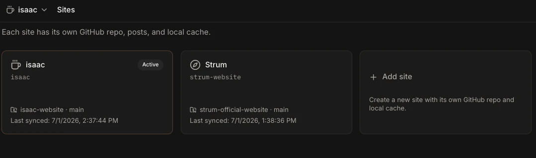
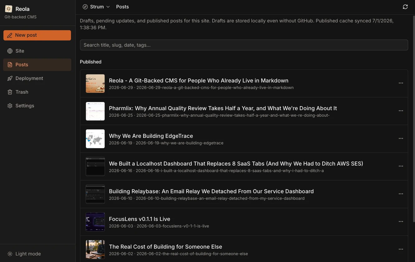
  • Some kind of CMS for content
  • Git and PR management
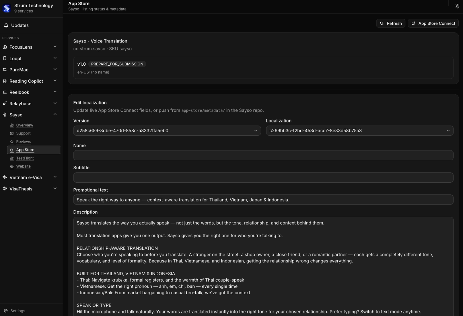
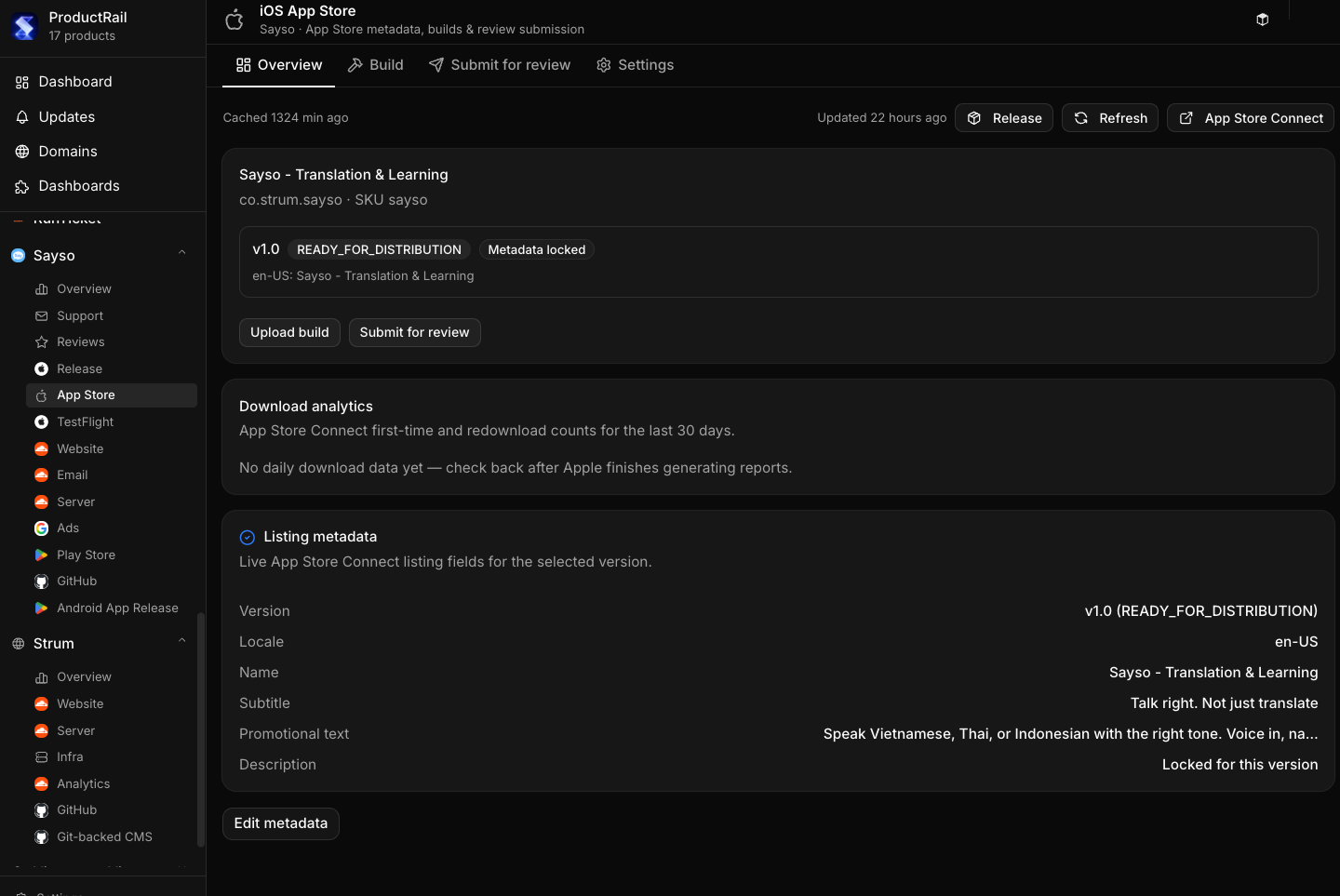
  • App Store and Play Store listings, screenshots, review status
  • Ad accounts — Google Ads, sometimes Meta
  • Transactional and marketing email

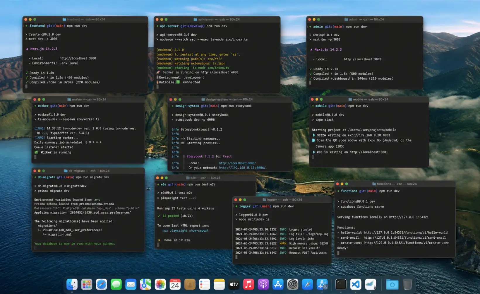
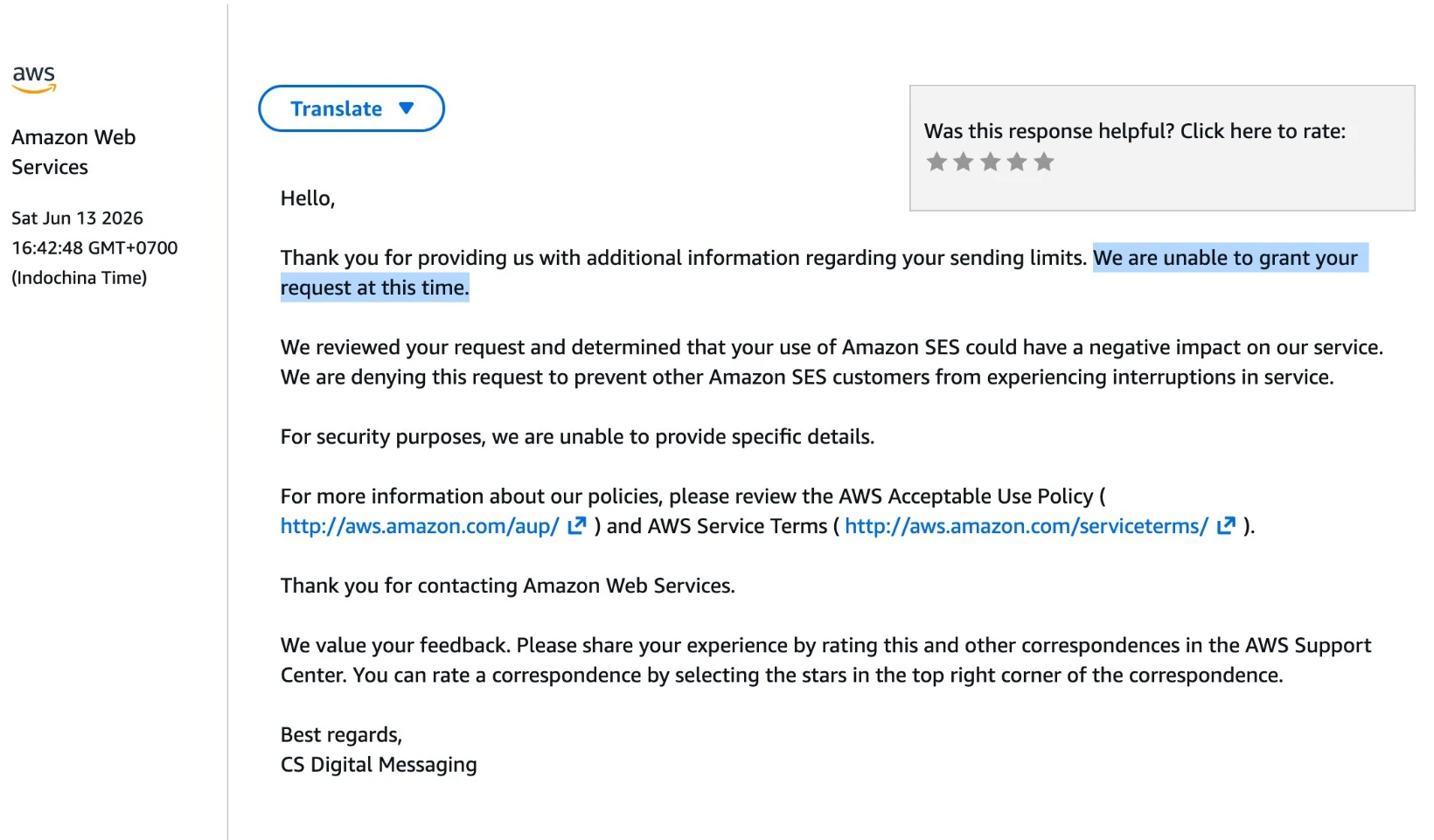
Multiply that by ten-plus products, and you're not building anymore. You're context-switching between a dozen dashboards, half of which you log into once a month and forget the password for. I found myself opening browser tabs just to remember what state each product was in. That's not a workflow — that's cognitive debt.

The actual failure mode isn't "I don't know how to do X." It's "I forgot X even needed attention." Things quietly break: a domain expiring, an ad campaign burning budget with no one watching, a support email sitting unread for a week. None of these are hard problems individually. They're expensive because of how many times you have to context-switch to catch them.

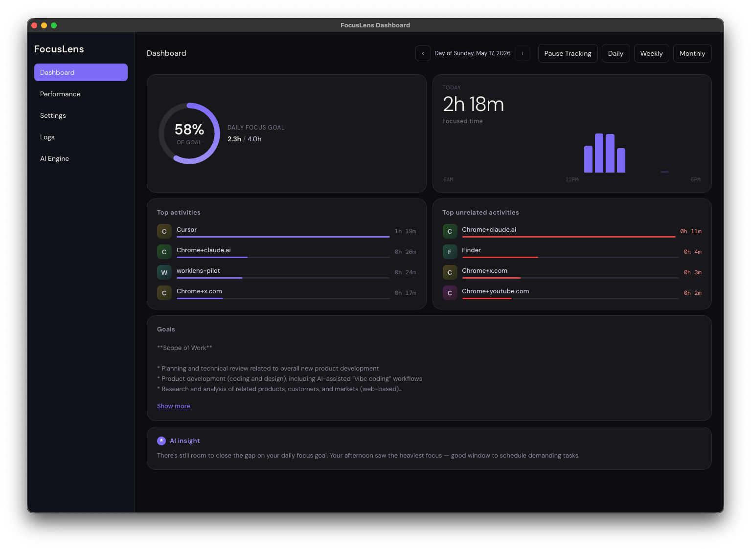
Wanting one dashboard to rule them all

image.png

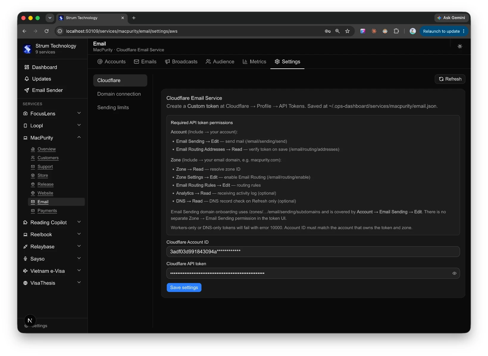
What I actually wanted was simple to describe and annoyingly hard to build: one place to see and manage everything, across every product, without having to log into ten different SaaS tools every day.

image.png

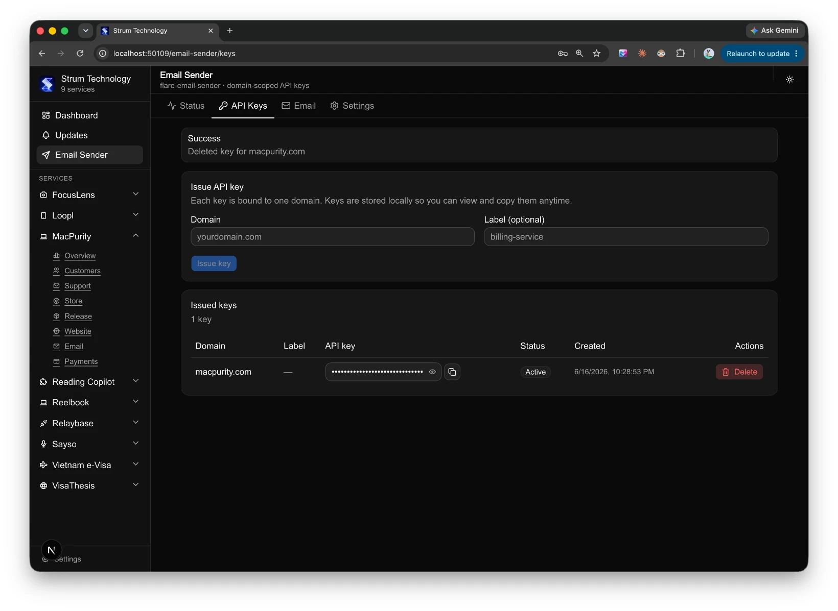
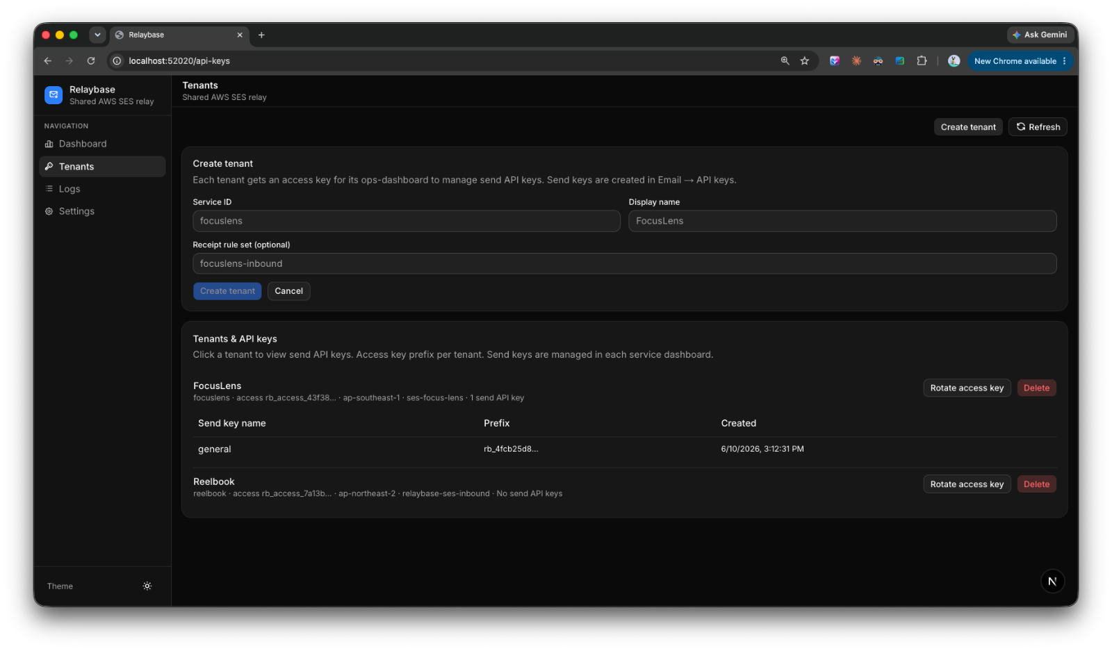
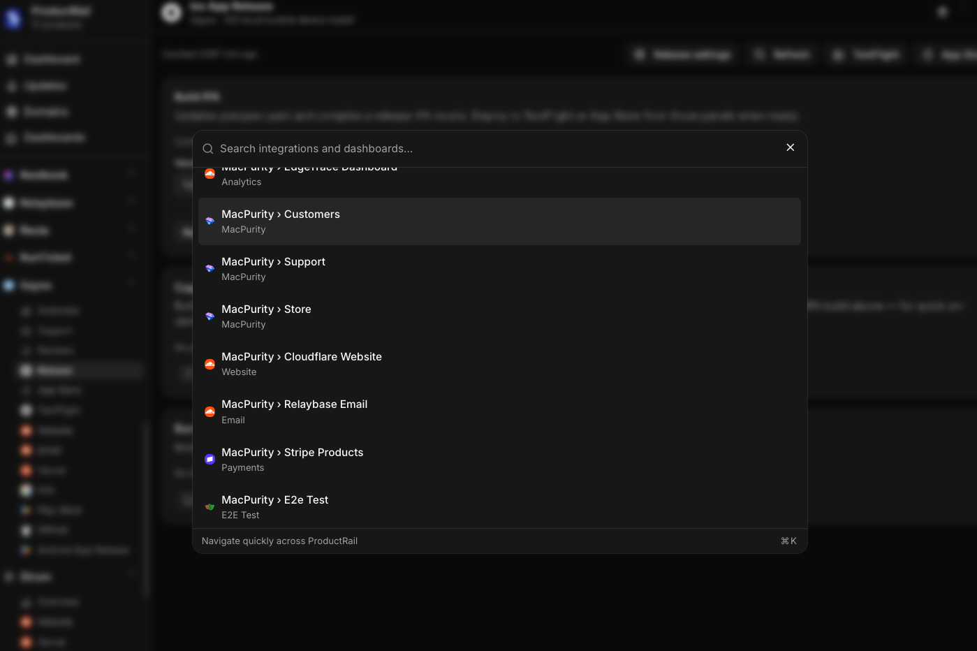
Not a replacement for those tools — I don't want to rebuild Stripe or Vercel or Google Ads. I just want a control layer on top. Connect everything via API keys and auth tokens, pull in the status and the actions I actually need, and stop pretending I can keep it all in my head.

image.png

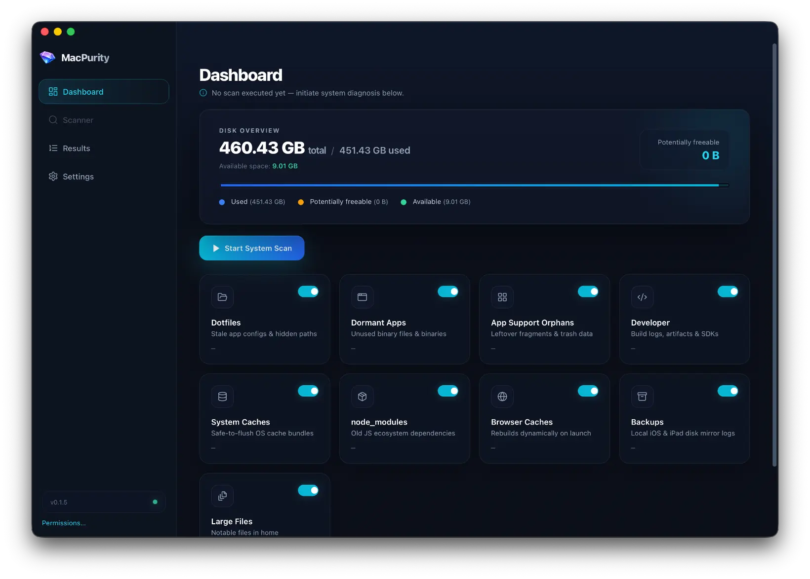
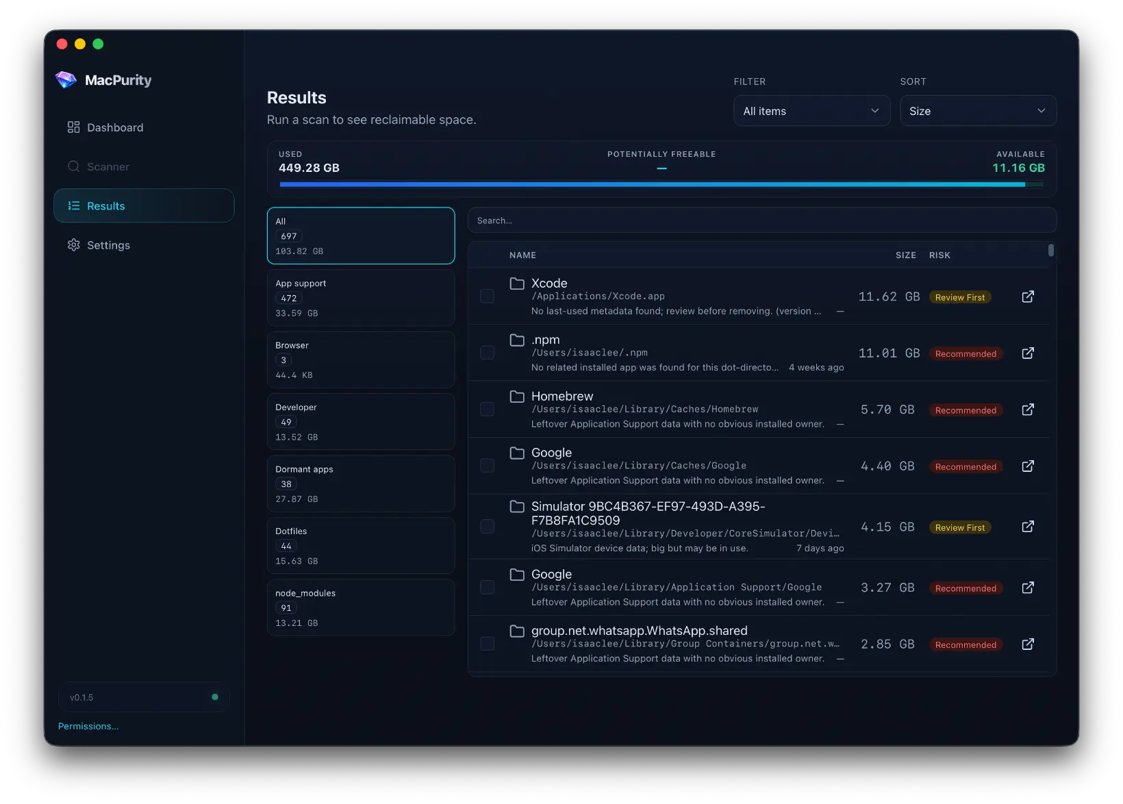
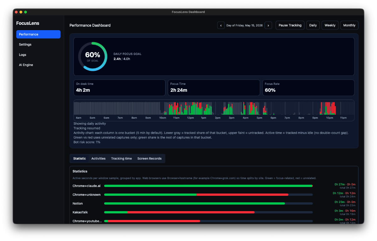
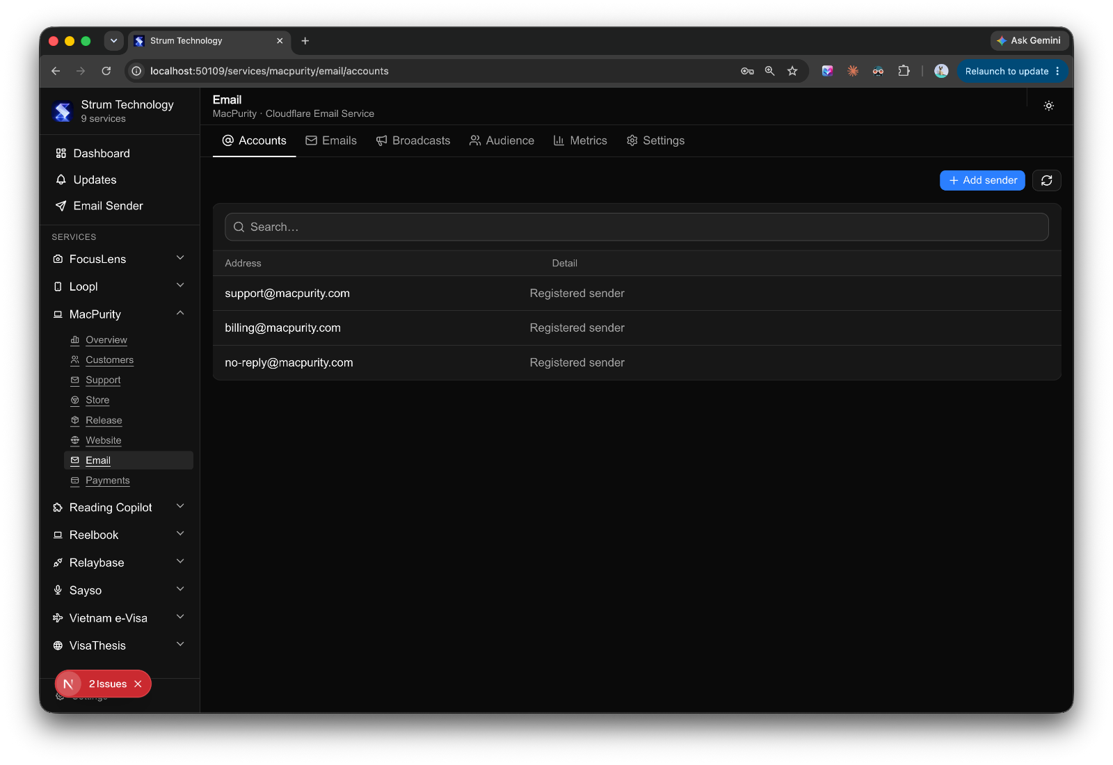
That's the idea behind what I've started calling Product Rail — a single dashboard that acts like a control tower for every product I run.

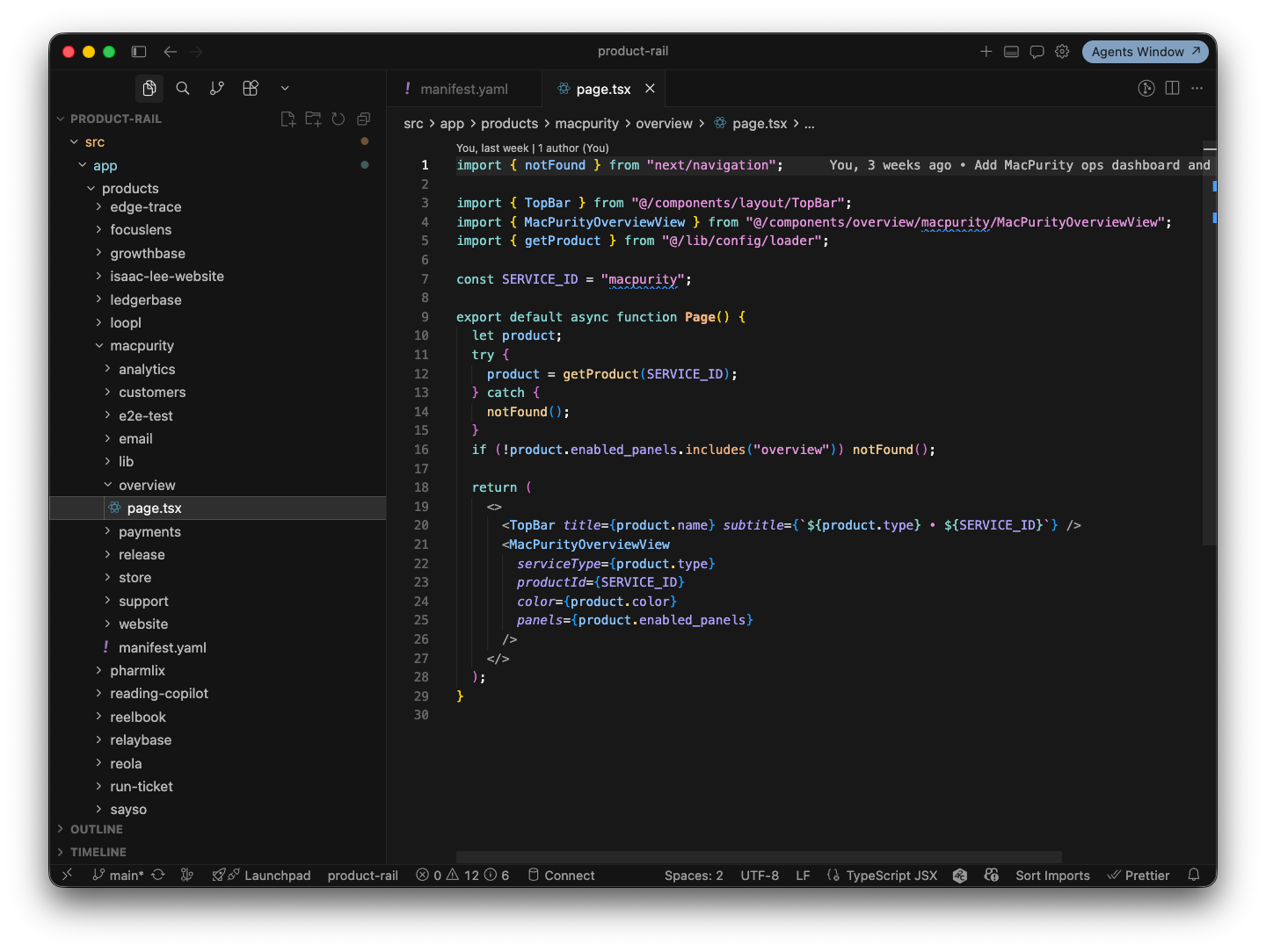
The interesting part: modules are reusable

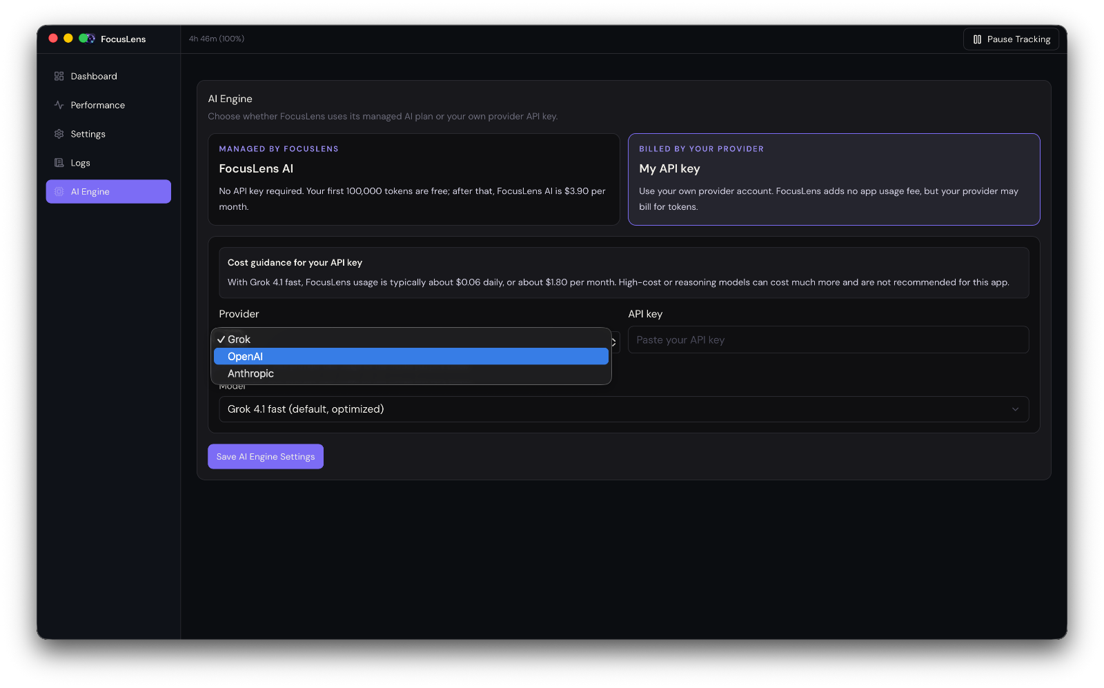
Once I started building this, something clicked. Almost every module I needed — domain status, deployment status, analytics summary, email queue, PR list — is the same shape across products. The data source changes, but the module doesn't.

image.png

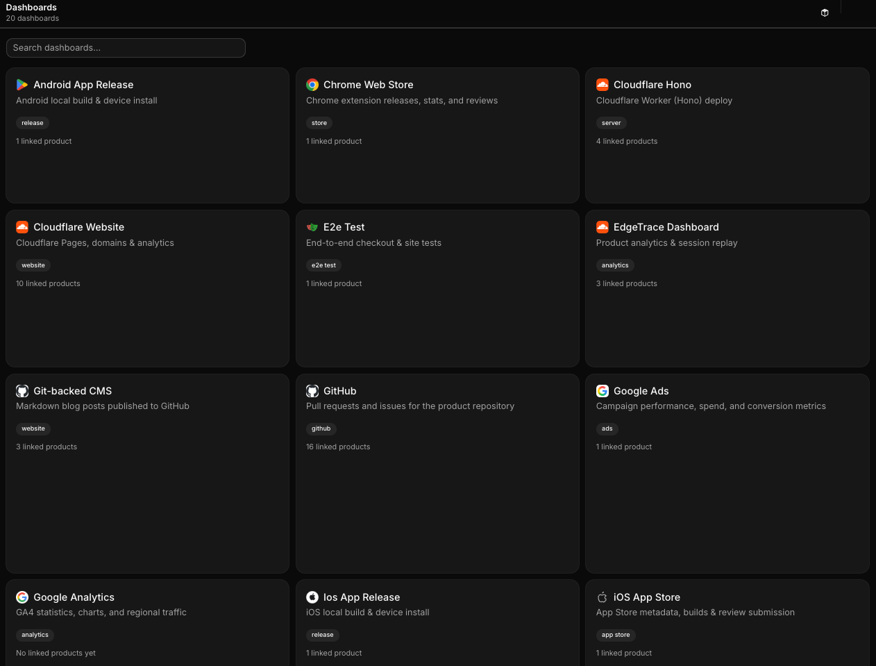
That means I'm not building ten dashboards. I'm building one dashboard framework and plugging different products into it. Each module is essentially plug-and-play: point it at a product, connect the relevant API, and it just works.

This reuse is the whole reason the project became viable. If every product needed a bespoke dashboard, I'd never finish. But because the underlying pattern — "here's a service, here's its status, here's the action I can take" — repeats everywhere, I could build once and reuse constantly.

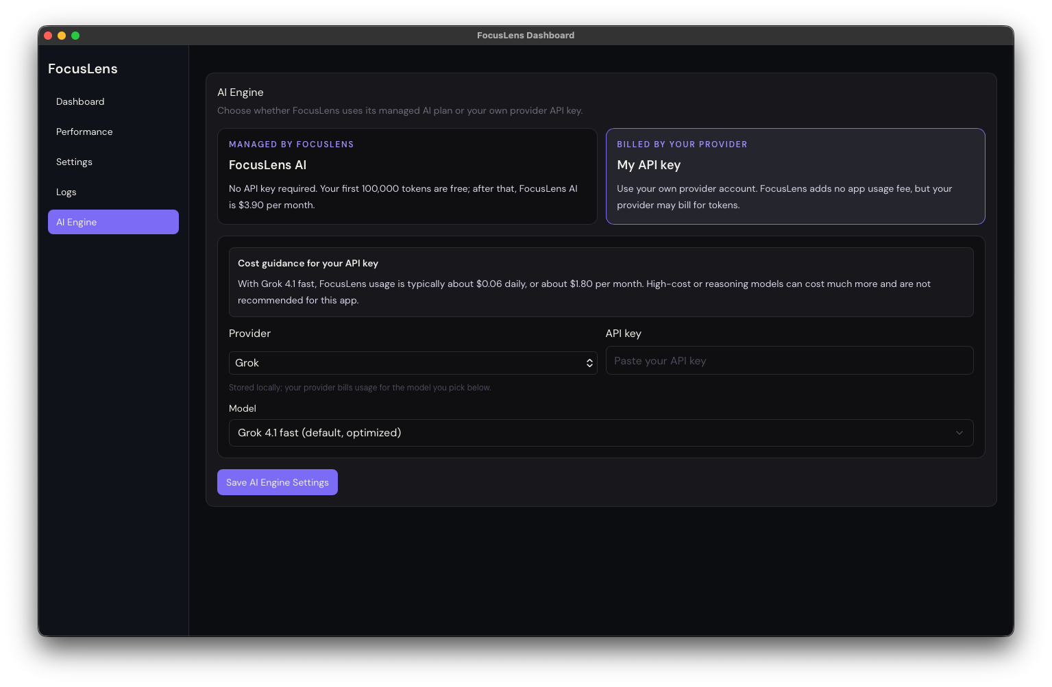
But some things need to be custom

The catch is that not every product is the same. Some need a custom module — a specific chart, a weird integration, a one-off action button that only makes sense for that product. Forcing everything into a rigid template would defeat the purpose.

image.png

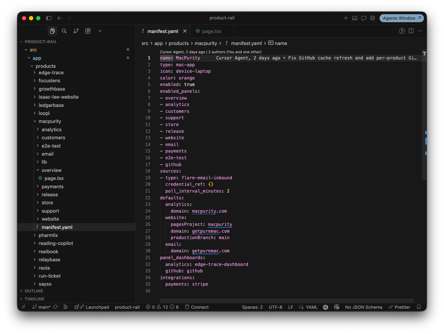
So I built a system where a base template gets copied into a product-specific folder in the codebase, and from there it can be revised freely. The default modules cover the 80% case. The last 20% — the custom bits — get built directly into that product's copy, without touching the shared template.

image.png

This is where it got fun.

Cursor, in the header, everywhere

Instead of manually going into the code every time I wanted to tweak a module, I put a button in the top right of the header — visible from anywhere in the dashboard — that opens Cursor (or Claude Code) right there.

image.png

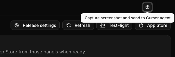
Click it, and you get a simple flow: drag to select the area of the screen you want to change, type a quick prompt describing what you want — "make this chart show weekly instead of daily," "add a retry button here," "this status badge should turn red if it's been down more than 5 minutes" — and that's it. The change gets made directly against that product's copy of the dashboard.

image.png

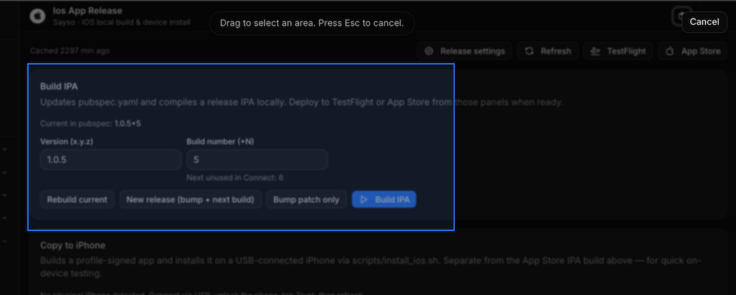
No opening a separate editor. No switching context to explain what you mean. You point at the thing, say what you want, and the dashboard evolves while you're using it.

image.png

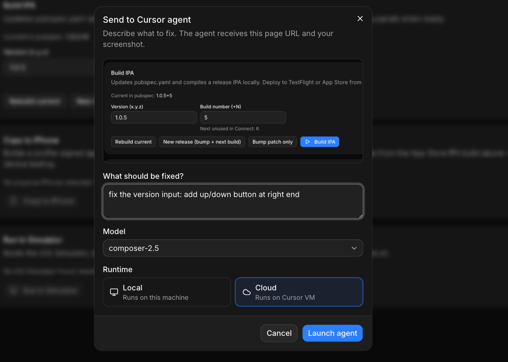
This turned the dashboard from a static tool into something closer to a living surface — one that adapts as fast as I notice something annoying. And when you're running many products, small annoyances compound fast. Being able to kill them in thirty seconds instead of filing a mental "fix later" note has changed how much friction actually survives day to day.

The actual payoff

I'll be honest about the trade-off: building this took time I could have spent on any single product. But the return has been bigger than expected. I'm not context-switching across a dozen tabs anymore. I glance at one screen and know what needs attention. When something needs a fix, I fix it inline instead of scheduling a "someday" task that never comes.

image.png

I think this matters beyond just me. A lot of solo founders and small teams are trying to build and launch multiple products at once — it's basically the current playbook. But nobody's really solved the operational side of running a portfolio, not just a single product. You need a control tower, not another point solution.

What's next

Right now this is my internal tool, built for my own products. But I'd like to make it public at some point soon — clean it up, generalize the connectors, and let other founders plug their own stack in.

For now, it's already done the thing I built it for: I don't have to go into every different SaaS service anymore. I just connect them once, and check one dashboard.

2026-07-01

Building Free Serverless Blog system with Github + CDN

Facts That Surprisingly Many People Don't Know

Many people think you need a server to run a blog. They naturally assume you need to pay for WordPress hosting, rent a server from AWS or Cafe24, connect a domain, and set up a database.

However, the truth is you can create a blog system deployed worldwide completely free without any of these steps. You only need two things: Github (free) and Vercel or Cloudflare (free for regular users). With just this combination, you can deploy web content to a Global CDN without a server.

The problem is that while the principle of this combination is simple, actually setting it up and integrating it with a good editing environment is more complicated than expected. Creating a website can be quickly solved with Cursor or Claude Code, but building a CMS for continuously managing content is a completely different issue.

The Principle Is Simpler Than You Think

The core principle of this system can be summarized in one sentence:

Upload markdown files in .md format and resource files like images and videos to Github, and the CDN distributes them statically worldwide.

In other words, you don't need a database or backend server. Content is just files, Github is a repository and version control system, and Vercel or Cloudflare build those files and distribute them to edge servers worldwide. Since visitors receive pages from the nearest CDN node regardless of their location, loading speed is fast.

image.png

Building this structure directly isn't impossible with AI coding tools like Cursor or Claude Code. You can create code to attach a markdown parser, commit files via Github API, and connect deployment hooks in a matter of days.

Three Problems That Remain

However, when you actually build and use such a system, there are practical issues that continue to cause headaches separate from the coding itself.

1. Image optimization problem. Every time you upload an image to your blog, you have to manually resize it and compress it to formats like webp. If you don't, page loading speed suffers and CDN traffic increases accordingly.

2. SEO-friendly filename problem. If you upload files with names like IMG_2938.png as is, it doesn't help with search engine optimization at all. You need to change them to meaningful names related to the content every time, which is surprisingly tedious to keep track of.

3. Abandoned file problem. When you edit posts or replace images, old files remain in the repository. Over time, it becomes impossible to distinguish which files are actually being used and which are dead files.

Ultimately, distributing content to a CDN without a server is free, but providing a "convenient and sustainable" CMS experience is a different matter entirely.

So I Created It: Reola

Reola is what I built to solve these problems directly. I started this project while managing the CMS for multiple sites I operate, aiming to eliminate the inconveniences I experienced, and now it's available as a free desktop app for anyone.

The main features Reola supports are as follows:

  • Notion-style markdown editor. Provides an editing experience based on the BlackNote engine, so you can write intuitively without knowing markdown syntax.
  • Automatic image compression. When you paste an image, it's automatically resized and converted to webp according to your specified compression method.
  • SEO content size indicator. You can check the total content size and refine your writing in an SEO-friendly format.
  • Local history feature. Track changes and restore previous versions if needed.
  • Automatic video compression. Even if you upload raw video, it's automatically compressed internally to reduce the amount uploaded to the CDN.
  • Git integration publishing and deployment tracking. Publish directly to your connected Github repository and monitor CDN deployment status in real-time.

image.png

  • Multi-site management. Manage CMS for multiple sites integrated in one app.

image.png

image.png

Domain Connection Is Separate, But Simple

The content distribution system itself is complete with just Reola, Github, and CDN, but if you want to use your own domain, you can purchase and connect it through Vercel or Cloudflare. This process takes only a few minutes on each platform's dashboard, so it's not particularly difficult.

Summary

Operating a fast-loading blog worldwide without server costs, database management, or complex deployment pipelines is an option that surprisingly many people overlook. The Github and CDN combination has been possible for a long time, but the real obstacle was the lack of conveniently usable editing tools.

Reola was created to remove that barrier. With just a Github account and Vercel or Cloudflare account, anyone can use it for free, and it automates the repetitive inconveniences encountered in CMS operations, from image compression to SEO filenames and abandoned file management.

If you want to run a content-focused site without operating your own server, I recommend checking it out at getreola.com.

2026-06-29

Reola - A Git-Backed CMS for People Who Already Live in Markdown

image.png

I've been a Notion fan for years, and somewhere along the way that turned into a habit of writing almost everything in markdown first. Blog posts, notes, half formed product ideas, all of it starts as plain text with a few headers and bullet points. It's fast, it's portable, and I never have to think about formatting.

The part that's never been fast is everything around the writing.

The actual problem

Every post I write ends up needing at least one photo or a short video clip, and that's where the friction starts. I drop a 30 MB screenshot or a screen recording into a folder, then I have to remember to resize it, convert it to something the web actually wants, and figure out where it's supposed to live relative to the post. None of that is hard on its own. It's just enough manual work that I'd put off writing for another day rather than deal with it.

What I actually wanted was simple. Write the post, drop in the media, and have it show up on the CDN already compressed, without a detour through an image editor or a separate compression script.

I looked at a few ways to get there. Most CMS products solve this by owning your content in their own database, which means your posts live behind someone else's API instead of in the same repo your site already deploys from. The ones that don't do that tend to assume you're comfortable hand editing files and running your own image pipeline, which puts you right back at the manual step I was trying to remove. None of it integrated cleanly with how my site is actually built, straight from a GitHub repo.

So I started building Reola.

What I'm building

Reola is a web & desktop markdown editor that publishes directly to GitHub. You write locally, drop in images and video, hit publish, and it commits straight to the repo your site already builds from. No Reola server sitting in the middle holding your content hostage.

What that looks like day to day:

  • A proper editing experience over markdown, WYSIWYG when I want it, raw markdown when I don't
  • Posts saved as plain files, {slug}/content.md, with frontmatter for title, date, tags, and slug
  • Drafts and a local repo cache living on disk under ~/.reola, readable with or without Reola open
  • Full Git history on every post, so a bad edit is just a revert, not a support ticket

The media pipeline I actually wanted

This was the whole point, so it got the most attention. Drop a full size photo or a raw video file into the editor, and Reola resizes images to sensible display sizes, converts them to WebP, and runs video through ffmpeg into a web friendly MP4 or WebM. No separate tool, no second pass to remember.

image.png

Settings are per post, quality, size level, WebP on or off, and the defaults are tuned so most uploads need zero manual work. I can drop in a forty megabyte photo straight from my phone and Reola ships the WebP version without me thinking about it again.

Git native, on purpose

The media pipeline solves the upload problem, but the bigger decision underneath Reola is where the content actually lives. Posts are markdown files in your repo, not rows in someone else's database. That means they're reviewable in a pull request, diffable like any other change, and recoverable from a git clone even if Reola itself disappeared tomorrow.

Publish pushes a commit to your configured branch through the GitHub API, and your connected CDN, Cloudflare Pages, Workers, or Vercel, builds and deploys from there the same way it already does for code. Reola sits upstream of that as the editor and the media prep step, not as new hosting infrastructure you now have to operate.

Why today specifically

I'm not the target user I had in mind when I first thought about a "blogging tool." I'm the writer side and the engineer side at the same time, which is exactly the gap Reola is trying to close. The people who'll actually use this day to day skew engineering and DevOps, people who already care about owning their content, who don't want a black box vendor between them and their words, and who'd rather review a content change in a PR than trust an opaque CMS dashboard.

image.png

That's also why the visual language splits cleanly into two layers. The warm, illustrated style you're seeing in this post is for marketing and onboarding, the part where Reola needs to feel approachable to someone who isn't going to read documentation first. The actual product UI, the editor, the Git settings, the deploy status screen, is a clean technical layer with none of that illustration in it. Mixing the two would undercut the exact thing this product is trying to earn, which is developer trust.

Where it stands right now

Early, same as everything else I ship. GitHub linking, WebP image optimization, and local file storage are working today. Deploy and domain connection through Cloudflare or Vercel, desktop packaging, and ffmpeg video compression are the active surface I'm building out in Settings right now.

Not in scope yet: multi-tenant billing, role based permissions, non-Git backends, or a hosted SaaS version. Those are natural next steps once the core loop, local draft to GitHub commit to live deploy, holds up under real use.

What's next

The honest test is whether I keep using it for my own posts, including this one. If writing and publishing to isaaclee.xyz through Reola feels better than my current habit of writing markdown and pasting it in by hand, I'll know the core loop actually works. I'll post the next update once there's a build worth clicking on.

#buildinpublic

This one's mostly a note to myself about why the media pipeline mattered enough to build a whole tool around it. If you've ever given up on writing a post because of the image resizing step, you'll probably get it.

reola-icon.png

2026-06-29

How Real-Time Translation Changes the Payroll Game for Global Teams

A laptop screen showing a split-view chat interface with Vietnamese text on one side translating to English in real-time

I've been thinking about a specific problem that most hiring platforms have completely backwards.

Platforms like Upwork solved the geography problem—you can hire someone from anywhere now. But they accidentally created a new constraint: you can only reliably hire people who already speak English well. That's a huge filter. It cuts out entire labor markets, keeps wages artificially high, and forces companies to pay premium rates just to avoid the friction of communication.

The real waste isn't in the hiring. It's in leaving talent on the table because of a language barrier that's increasingly solvable.

The Vietnam Opportunity Nobody's Really Chasing

Here's what's interesting about Vietnam specifically. Countries like India and the Philippines built their entire remote workforce brand on English proficiency. That's their competitive advantage, and it's real—if you want someone who can jump on a call and sound native-level comfortable, those markets deliver.

But that also means everyone's competing for the same pool, which drives wages up. And it completely ignores the enormous workforce in countries like Vietnam where professional-level English just isn't the norm, but the actual skill—whether that's marketing, design, operations—is absolutely there.

The constraint was communication. The solution used to be "hire someone who speaks English." The new solution is: don't require that constraint at all.

A project dashboard showing team members from different countries with real-time translation status beneath each message thread

What AI Translation Actually Changes

I'm not talking about throwing Google Translate at Slack messages and hoping for the best. Context matters. A marketing professional in Ho Chi Minh City talking about campaign performance has industry vocabulary, casual phrasing, and cultural references that generic translation breaks on constantly.

What changed recently is that LLM-based translation with enough context can actually handle that. Real-time chat translation that understands you're talking about CAC and LTV, not just translating words. Messaging that preserves tone and intent, not just literal meaning.

That's the difference between "we tried hiring overseas and it was too confusing" and "we hired someone great and barely noticed the language difference."

Why This Works as a Service

Here's where it gets practical. Payroll is already a nightmare for distributed teams. Tax withholding, local compliance, payment methods, contractor versus employee status—it's the part of hiring that makes most founders just pick someone easier.

Bolt on translation and communication infrastructure, and suddenly you're solving two problems at once: the payroll friction and the communication friction. Neither one on their own is enough to switch platforms. Together, they're worth it.

You're not just paying someone in Vietnam at a lower cost. You're getting the same quality communication you'd have with a US-based hire, without the wage premium. The gap closes enough that it actually matters.

Starting Narrow, Expanding Later

The honest version is that I'm building this from a position of having some real-time advantage. I've spent the last year in Da Nang, I have a local network, and I understand the local market in a way someone building this from California doesn't.

So the first version is narrow: marketing professionals. People managing campaigns, doing content, handling community, running ads. Marketing is communication-heavy, context-rich work. If the translation layer works well enough that a Vietnam-based marketer can run a US campaign without friction, it proves the whole concept. Other disciplines follow from there.

The Real Shift

The deeper thing here isn't about cost arbitrage. It's about realizing that the constraint you've accepted as permanent—"I can only hire English speakers"—isn't actually permanent anymore. It was never about the capability. It was about the tooling.

Once the tooling catches up, you're not forced to choose between great talent and clear communication. You pick the better person, and the communication problem solves itself.

That's the kind of shift that seems small until you see what actually happens when you remove it.

2026-06-29

From Idea to Deployed: Building a Rapid Development Platform for Custom Software

When I talk to entrepreneurs and small teams about their software needs, I hear the same frustration over and over. They have a clear vision for what they want to build, but the path from concept to a live product feels impossibly long and expensive. They either spend months iterating with a developer, or they try to force their idea into an off-the-shelf template that never quite fits right.

That gap between "I have an idea" and "it's live on the internet" is exactly what I've been thinking about. What if we could compress that timeline dramatically—not by cutting corners, but by being smarter about how we build?

The Problem With How Software Gets Made Today

Most custom development follows a familiar pattern. You spend weeks in discovery meetings. Then you wait for estimates. Then development starts, and halfway through, something fundamental changes about what you actually need. By the time your product ships, you've spent months and tens of thousands of dollars, and half the time it still isn't quite what you imagined.

A timeline showing traditional software development stretched across months with multiple revision cycles

The real issue isn't that custom development is slow. It's that the feedback loop is broken. You can't see what you're building until it's mostly built. You can't touch it, click it, or test your assumptions until the developer hands it over.

There's also a hard truth: not every project actually needs six months of engineering. A lot of what businesses want to build—internal tools, customer portals, marketplace features—follows predictable patterns. We've solved these problems dozens of times before. We're just solving them from scratch for each new client.

A Different Approach: Requirements First, Deploy in Six Hours

I've been building a platform that inverts how this usually works. The idea is simple on the surface: compress the entire cycle from concept to live product into a predictable, guaranteed timeline.

Here's how it actually works:

Phase One: AI-Powered Requirements Discovery

This is where everything changes. Instead of sitting through endless meetings, a client starts a conversation with an AI system trained specifically on technical discovery. The AI asks the right questions in the right order—the kind of questions a senior architect would ask if they had unlimited time.

The AI isn't just taking notes. It's building a requirements document in real time. It's asking for reference images. It's pushing back on vague ideas and forcing specificity. It understands that "a booking system" could mean twenty different things, and it narrows it down.

This discovery phase culminates in a clickable prototype. Not a wireframe. A real, interactive prototype you can actually use. The client can see the flow, test the assumptions, and approve the direction before a single line of production code gets written.

A screenshot showing the prototype creation interface with sample modules like booking, catalog, chat, and notifications

The discovery phase has a cost—I charge a flat fee of about fifty dollars—but it comes with strict guardrails. The AI has a token budget. You can't infinitely refine. At some point, you have what you need, you approve it, and you move forward.

Phase Two: Guaranteed Six-Hour Deploy

Once requirements are locked in, a human developer takes over. Not to start from scratch, but to assemble from proven pieces.

The system works with modular components. Booking system. Catalog. Chat. Notifications. Analytics. The client picks up to five modules that match their needs. Within those constraints, the developer builds, integrates, and deploys everything in six hours.

This isn't magic. It works because:

  • We're not inventing anything new. These modules already exist.
  • We're not configuring anything manually. Domain setup, database migration, Git integration, server deployment—all automated.
  • We're not guessing about requirements. They're locked in from the prototype phase.
  • We're not optimizing for perfection. We're optimizing for "works live today."

The developer gets the requirements, pulls the relevant module code, wires everything together, and pushes it live. By the time six hours is up, there's a real product accessible at a real domain. There's an admin panel. There's a database. There's a Git repository tracking every change.

If it's a mobile app, it goes straight to TestFlight. If it's a web app, it's live on the URL. If it's a desktop application, it's packaged and ready.

Why This Actually Works

The traditional argument against "rapid development" is that you're sacrificing quality. That's only true if you're trying to be rapid about the wrong things.

I'm not trying to be rapid about discovery. I'm not trying to be rapid about requirements. I'm not trying to be rapid about making architectural decisions. Those things need time and thought.

What I'm being rapid about is execution on known patterns. If you know exactly what you want to build, and it fits into an existing module ecosystem, the actual coding step is where we've already removed all the friction. No setup. No configuration. No decisions. Just assembly.

The other thing that makes this work is honesty about scope. Not every project qualifies. If you need a completely novel integration, or if your requirements are so custom that they don't map to any existing module, this approach isn't for you. But most projects—probably more than you'd expect—do fit into that pattern.

Where It Actually Lives

The product itself is a web platform. You start by describing what you want to build. The AI discovery system runs you through a structured conversation. You approve a prototype. You pay the discovery fee. Then a developer slots you into their calendar.

Six hours later, you have a live product. Full deployment pipeline. Real database. Integrated with your domain. Git history ready for future changes.

What Gets Left Out (On Purpose)

This system is built for speed, which means some things are deliberately out of scope:

  • Multi-tenant SaaS complexity
  • Advanced role-based permissions
  • Custom backend logic that doesn't fit the modules
  • Complex third-party integrations
  • Long-term ongoing maintenance and scaling

Those are problems you solve after you launch and know what actually matters. What you get is a functioning product today. From there, you can iterate, refine, and customize for the real world instead of for imagined scenarios.

The honest test is whether someone would actually use this instead of hiring a traditional developer or building it themselves. If the promise of "I'll have a working product in six hours" is worth more than the money you save by DIY, then it works. If having a human review your requirements and personally build your system matters more than the speed, then traditional development wins.

I think for a lot of people, though, there's a third option they've never had: something faster than the long custom development cycle, but more thoughtful than throwing your idea at a no-code platform and hoping it fits.

2026-06-27

Why I'm Building Dev App Launcher: A Menu Bar Fleet for Too Many Dev Servers

building · product · buildinpublic

Today I hit the same wall I hit every few weeks. A Cursor agent was mid session on one project, three other dev servers were parked in random terminal tabs, and my fan had been screaming for ten minutes before I figured out which process was actually causing it. I killed the wrong one, lost a hot reload, and spent five minutes digging through scrollback just to find which port belonged to which repo.

That's usually the moment I open a new repo and start building the fix instead of finishing what I was supposed to be working on.

The actual problem

I'm never running one app. On a normal week I'm bouncing between several products, each with its own dev server, its own ports, sometimes its own production preview build, plus whatever side project I started two weekends ago. Add Cursor running multiple agent sessions in parallel, and the terminal stops being a workspace and starts being a liability.

image.png

The specific failure modes I keep hitting:

  • I forget a server is running until the laptop heats up
  • Dev and prod preview commands get mixed up because they live in the same tab
  • A Cursor agent finishes editing code, and I still have to manually rebuild, restart, and refresh to see if it worked
  • Logs are scattered across panes with no quick way to grab one and paste it into a bug report

None of these are hard problems on their own. Together they're a constant, low grade tax on every coding session, the kind of friction that never makes it onto a roadmap but still eats an hour a day.

What I'm building

I'm calling it Dev App Launcher. It's a native macOS menu bar app, built with Tauri, that treats my machine like a small fleet instead of a pile of unrelated terminal tabs. Register a project once, and it remembers the scripts, ports, and commands. After that, everything is one click from the tray.

What that gets me:

  • One popover showing every registered app, running or stopped, with live CPU and memory per process
  • Start, stop, restart, and build per app, with a separate toggle for dev versus production preview
  • A folder scanner that pulls every package out of a monorepo in one pass instead of registering each one by hand
  • Logs streamed inline, with a one click export for when something breaks and I need to paste the output somewhere

The piece I actually care about most is the Cursor integration. When an agent session ends, the launcher gets a hook, rebuilds the project, restarts the production preview, and sends a notification. If the build fails, it can hand the error straight back to a Cursor agent for another pass. That's the loop I want: code changes, preview updates, nothing manual in between.

Why today specifically

I'm vibe coding fast enough across enough products now that the manual rebuild step has quietly become the slowest part of my workflow, slower than the AI generating the code in the first place. Everything else in my stack already runs itself: Cloudflare deploys, the ops dashboard, the build servers on the two M2 minis sitting idle in the corner. The one thing still living entirely in my head and my terminal history is "which app is running where, and did I actually restart it after that last agent run." That's a small enough problem that it should have been solved months ago, and an annoying enough one that today I finally stopped putting it off.

Where it stands right now

Early. The core loop, register an app, see it in the tray, start and stop it, is the part I'm building first. Resource monitoring and the Cursor hook come right after. Things like team sync, Linux support, or proper HTTP health checks are on the list, but they're not built, and I'm not promising them yet.

What's next

I'll run it on my own stack first, the same products that gave me the problem in the first place. If the Cursor loop holds up the way I'm hoping, closing the gap between "agent finished" and "preview is live" with zero steps in between, this becomes the thing I open before I ever open a terminal.

#buildinpublic

This one's mostly for me. If you're also running more local services than you can comfortably track in your head, I'll post the next update when there's something to actually click on.

2026-06-16

I Built a Localhost Dashboard That Replaces 8 SaaS Tabs (And Why I Had to Ditch AWS SES)

product · building

As a solo founder running multiple products, I've been drowning in browser tabs.

Xcode, GitHub, Cloudflare, Stripe, Google Analytics, customer emails. Every morning starts the same way: open tab, check status, close tab, open next tab. It sounds trivial until you realize you're maintaining five separate products and the cognitive overhead of context-switching across eight different dashboards is quietly killing your focus and your mornings.

So I started Operation Dashboard: a single localhost interface that handles everything without me ever leaving it.


The Goal

One page. Everything operational.

  • Xcode build status
  • GitHub releases
  • Cursor / website release note updates
  • Email management (billing@, support@, hello@, and beyond)
  • Cloudflare deployments
  • Google Analytics snapshot
  • Stripe revenue and subscription data
  • Customer management

Most of this is now working. Email, Stripe, and GA are the remaining pieces. But the email story in particular turned into its own adventure worth writing about.


Why Email Was the Hard Part

Every product needs transactional and operational email addresses. billing@, support@, noreply@, hello@. That's four per product, times five products — you do the math.

image.png

The obvious solution is Google Workspace. But at $7 per seat, adding 10 or 20 email accounts across your products costs $70-140/month just to have addresses. That's before you ship a single line of code. For a solo dev, this isn't sustainable. It's a tax on ambition.

So I went hunting for alternatives, and landed on AWS SES.


The AWS SES Rejection (And Why It Stings)

I spent time building the full SES integration, wiring up the sending service, configuring DKIM and SPF records, and testing delivery. Everything worked in sandbox mode. Then I submitted the production access request and waited.

A few days later: rejected.

image.png

No clear reason given — AWS doesn't officially explain rejections. But after digging into forums and developer communities, the pattern emerged: accounts created via Gmail are more likely to get flagged. The suspicion is that you're applying for SES purely to send email (which, yes, is exactly what SES is for), but without a "real" AWS infrastructure footprint behind it, production access gets denied.

I submitted a more detailed follow-up with specifics about my use case. Same result.

This is genuinely frustrating. The approval process takes days. The rejection criteria are opaque. And the irony is that SES's entire value proposition is sending email at scale for legitimate businesses. A solo developer trying to replace Google Workspace for five small products is about as benign a use case as you'll find.

So I moved on.


Cloudflare Email: $5/Month and It Just Works

image.png

I was already running most of my Hono backend services on Cloudflare Workers. The free tier is genuinely powerful for CDN and lightweight API work, and I'd been defaulting to it for most of my serverless infrastructure.

What I hadn't noticed: Cloudflare launched email sending about two months ago. It's part of the Workers Paid plan at $5/month.

I dropped the AWS SES code, rewrote the sending service using Cloudflare's email API with Hono as the backend, and deployed it. The whole migration took a fraction of the time I'd spent waiting on AWS.

What you get for $5/month:

  • 3,000 outbound emails included
  • Unlimited email addresses on your own domains
  • Zero per-seat pricing. Ever.

image.png 
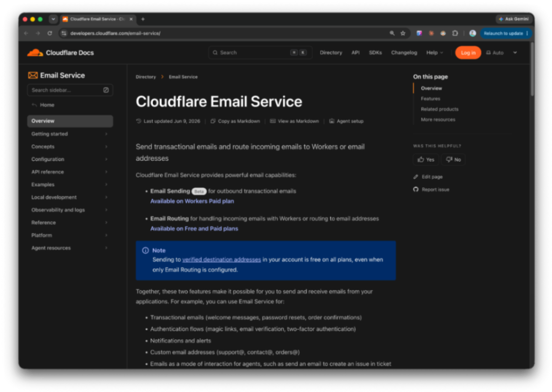
https://developers.cloudflare.com/email-service

That last point is the one that matters. Whether I create 2 email addresses or 20 across all my products, the cost doesn't change. Compare that to Google Workspace at $7/seat: 10 accounts = $70/month, 20 accounts = $140/month. Every new product you launch, every new address you need, the meter runs.

For a solo developer managing multiple products, Cloudflare's model is simply better math.


What the Dashboard Actually Looks Like

The architecture is straightforward: a localhost server that pulls from each service's CLI or API, surfaces only what I need to see, and lets me take action without opening a separate tab.

GitHub releases and Cloudflare deployments were the easiest — both have clean APIs. Xcode build integration required a bit more work with xcodebuild output parsing, but it's running. The email service now routes through the Cloudflare Hono worker.

image.png

What's left: wiring in Stripe webhooks for a live revenue view, pulling GA event data into a single metrics panel, and cleaning up the customer management view.


Why This Matters for Solo Developers

The point isn't the technology. You can build this with any combination of tools.

The point is that fragmented tooling has a real cost. Every time you context-switch between dashboards, you lose a few seconds of focus. Multiply that by eight tools, five products, and every working day of the year. More importantly, important things get missed. A failed deploy, a Stripe dispute, a support email that waited three days because you forgot to check that tab.

Consolidating operations into a single interface isn't just about convenience. It's about building a system that surfaces what needs attention, when it needs attention, without relying on you to remember to go look.

I'll post a proper technical breakdown once the final pieces are in. But the AWS detour was worth documenting, if only to save someone else a few days of waiting.


Running multiple products solo out of Southeast Asia. Writing about what actually works.

2026-06-10

Building Relaybase: An Email Relay I Detached From My Service Dashboard

building · product · buildinpublic · infrastructure

The first frustration was Google Workspace. Too expensive to manage the way a product actually needs email — billing@, support@, no-reply@, subscriptions@. Each address feels like it should be trivial. Together they add up fast, and you're paying per seat for inboxes you mostly need as send-from addresses, not places someone sits and reads mail all day.

So I looked elsewhere. Every product I ship eventually needs email anyway — password resets, license keys, support replies, onboarding nudges. The list is boring and endless. And every time, I end up in the same place: AWS SES. Domain verification. DKIM tokens. Sandbox limits. IAM policies. Receipt rules for inbound mail. Console tabs I don't want to reopen.

I built Relaybase to hide that behind a simple HTTP API — send mail, verify domains, read inbound messages, manage API keys — without talking to AWS directly.

Then I realized the email UI didn't belong inside my ops dashboard at all. So I split them.


What Relaybase is

Relaybase is an email relay on top of AWS SES. One server, multiple tenants — one per product (focuslens, macpurity, whatever you're running).

image.png

Each tenant gets:

  • A send API key (rb_...) for SES operations — send, inbox, domains, identities, production access
  • An access key (rb_access_...) for managing send keys via /api/keys

Typical flow:

  1. Operator creates a tenant and hands you an access key
  2. You paste that into your service dashboard (Email → Relaybase settings)
  3. From there you create send keys, verify a domain, optionally wire up inbound S3
  4. Your app calls POST /api/send with a send key — done

No AWS SDK in your product code. No console archaeology when something breaks.

curl -X POST https://relay.example.com/api/send \
  -H "Authorization: Bearer rb_..." \
  -H "Content-Type: application/json" \
  -d '{
    "from": "hello@example.com",
    "to": "user@example.com",
    "subject": "Welcome",
    "text": "Thanks for signing up."
  }'

Inbound works the same way: SES receipt rules drop mail into S3, Relaybase exposes GET /api/inbox and GET /api/inbox/:key with parsed headers and bodies. Sandbox exit, identity verification, domain DKIM — all HTTP endpoints with JSON responses and readable errors.


Why I started building it

Google Workspace wasn't the only dead end. Transactional email SaaS is priced for volume or teams. SES is cheap to send, but expensive in time — especially when you're running several products solo. Focus Lens, PureMac, Sayso, this site. Each one needed its own addresses, and each time I was re-solving the same SES setup.

The pain wasn't sending a single test email. It was the operational surface:

  • Verifying a new domain and waiting on DNS
  • Tracking sandbox vs production access per account
  • Rotating keys without breaking a live app
  • Reading inbound support mail without opening Gmail or the AWS console

I wanted one relay I control, with a stable API my apps and dashboards can share. Not per-seat inbox pricing. Not copy-pasting IAM snippets into every repo.

Relaybase is that layer — SES underneath, HTTP on top, multi-tenant by design.


The ops dashboard problem

A few weeks ago I wrote about managing multiple products from one internal dashboard. Sayso App Store builds, release metadata, the glue work nobody demos but everyone feels.

Email landed in that dashboard too. Domain setup, API keys, inbox, SES account status — all wired per service (Focus Lens, MacPurity, …).

It worked. But it was the wrong shape.

Email panels are heavy. They pull in AWS concepts, Relaybase credentials, verification state, inbound buckets. App Store panels pull in TestFlight and ASC. Website panels pull in Cloudflare. None of that is really "email" — it's per-service infrastructure.

Keeping email embedded meant the dashboard was secretly an email admin tool that also happened to deploy Sayso builds. Every new product meant cloning another email settings stack instead of adding a manifest entry and the panels that product actually needs.


Detaching email to make the dashboard general

So I split the architecture:

Relaybase — standalone email relay + its own admin panel (tenants, logs, AWS defaults, access key rotation). Provisions tenants; each tenant gets an access key you paste into a service's ops UI.

Ops dashboard — a general service dashboard. Services are discovered from manifest.yaml files. Each service declares which panels it needs: overview, release, app-store, website, email, support, and so on. Sayso gets App Store and TestFlight. Focus Lens gets release, website, and email. Relaybase itself gets an infra panel for operator work.

Email in a product dashboard doesn't talk to AWS. It talks to your Relaybase tenant via that access key. Send keys are created in Email → API keys; the relay handles SES on the other side.

That separation matters:

  • Relaybase stays focused — one job, one API, one place to monitor sends and logs
  • The ops dashboard stays general — add a service, enable panels, plug in credentials. No email code leaking into unrelated features
  • Products stay thin — POST /api/send with a key, not SES SDK wiring in every app

What's next

Relaybase is running for my own products now. The ops dashboard is where I manage everything else — releases, stores, websites — with email as just another panel type backed by the relay.

If you're a solo builder running multiple services, the pattern I keep coming back to is: extract the shared infrastructure, keep the dashboard generic. Email was the first piece worth pulling out. It won't be the last.


#buildinpublic

Infrastructure posts aren't flashy. But getting email and ops out of the way is what makes shipping the actual product feel possible again. I'll keep wiring things in as the stack grows.

2026-06-03

FocusLens v0.1.1 Is Live

building · product · buildinpublic

I've been tracking my own focus for months with an internal tool. Screenshots every five minutes, Apple Vision OCR, an LLM scoring each capture against what I said I was working on. It worked well enough that I kept running it every day.

So I cleaned it up, packaged it, and shipped it.

image.png

FocusLens v0.1.1 is live at focuslens.me.


What it actually does

Most time trackers count hours. That's not the problem. The problem is that two hours of "working" can contain forty minutes of actual focus and eighty minutes of browser drift, and most tools can't tell the difference.

FocusLens can.

Every five minutes it takes a screenshot, runs Apple Vision OCR on it locally, and sends the result to an LLM with one question: does this match what the user said they're working on?

image.png

You define focus. The AI scores it. You see the actual number.


The local-first part matters

The whole pipeline runs on your machine. Screenshots are processed on-device. Logs write to a JSON file in your ~/Library. Nothing touches a FocusLens server because there isn't one.

That's not just a privacy talking point. It's the architecture that makes the pricing work.

You bring your own API key — OpenAI, Anthropic, xAI — and pay your provider directly. Typical usage runs around $0.06 a day with Grok 4.1 Fast. If you'd rather skip the provider setup entirely, there's a FocusLens AI option: 100k tokens free, then $3.90/mo.

image.png

No per-seat pricing. No subscription for the app itself. No cloud backend you're paying to keep warm.


Why Grok 4.1 Fast as the default

This is a continuous capture workflow. The model runs every five minutes, all day.

That means the cost per call has to be extremely low, and the latency has to be invisible. Grok 4.1 Fast is $0.20/$0.50 per million tokens. It's fast enough that classification doesn't lag the capture loop. And it's accurate enough for the job — this isn't a reasoning task, it's a relevance check.

image.png

Higher-tier models cost more and don't improve the output in any meaningful way for this specific use case. The cost math just doesn't hold.


What's in v0.1.1

  • Menu bar app — start, pause, quit without breaking focus
  • Dashboard — daily goal, performance trends, focus percentage, app breakdown
  • Logs — every capture, its score, its reason, its estimated cost
  • AI Engine panel — swap providers or models in one place
  • Apple Silicon native, 10MB, no background agents

What's not in yet

The Windows build is coming. I'm on Apple Silicon and the native capture pipeline is macOS-specific right now. The core loop is the same, the plumbing is different.


The thing this is really about

I built this because I kept finishing days unsure whether I'd actually worked. Not tired — just uncertain. The focus tracker gave me a number to argue with, and the number was usually more honest than my memory of the day.

If you're building solo and you recognize that feeling, this is for you.

focuslens.me · v0.1.1 · Apple Silicon

2026-06-02

The Real Cost of Building for Someone Else

I've been a builder my whole career. Shipping products is the part I love — the part that feels natural.

So when a few people in my circle asked if I could help them build their ideas, I said yes without thinking much about it. I know how to code. I know how products work. How hard could it be?

Turns out, the hardest part wasn't the code.

image.png


Communication is the actual bottleneck

Building for yourself is simple. The product manager and the engineer are the same person. Decisions happen in your head instantly. Pivots cost nothing.

Building for someone else is a completely different game.

What I discovered — and what nobody really talks about — is that the development time is almost never the bottleneck. The bottleneck is everything that happens before a single line of code gets written. Figuring out what they actually want. Translating vague ideas into concrete requirements. Iterating on wireframes. Getting alignment on scope. Handling the "oh, I forgot to mention" moments that surface after you've already built the thing.

In one project, I spent maybe 12 hours actually coding. I spent 3x that in back-and-forth messages, calls, screen shares, and revised documents.

That ratio felt wrong. And inefficient. And expensive — for both sides.


The realization

If communication is the dominant cost, then the right solution isn't to hire faster developers. It's to radically compress the communication phase.

And if most products share a common set of building blocks — authentication, reservations, payments, notifications, admin dashboards, catalogs, chat — then the development phase can be compressed too. Not by cutting corners, but by having pre-built, production-ready modules that already know how to talk to each other.

Put those two things together and you get a very different kind of service. One where a client could go from "I have an idea" to a live, deployed product in 6 hours.

That became the product I'm now building.


image.png

How it works

The first phase is AI-driven requirements analysis. A client talks to an AI that does what I used to do manually — asking the right questions, in the right order, until the full picture is clear. What do you need? Who's it for? What does success look like? What's definitely out of scope? What references inspire you?

The AI doesn't move on until the requirements are actually complete. Not just answered — complete. It even asks for brand images, reference screenshots, style preferences. All the things that normally show up in week three of a project, when you're already deep in implementation.

When the AI is confident it has enough to work with, the client pays a small fee (₩49,000 / $49). That fee is the gate to the next phase.

After payment, an AI prototype gets built automatically. The client sees real screens — not static mockups, but interactive Next.js pages with realistic mock data. A flow view shows how the screens connect. The client confirms or requests changes. All before a human developer has touched anything.

Only after that confirmation does a developer get assigned. They have the requirements doc, the prototype, and access to a library of pre-built modules. They pick the modules that fit — maximum five, which is the constraint that makes the 6-hour guarantee possible — and build outward from there.

When the build is done, deployment is fully automated. Domain, server, database, GitHub, admin panel — all wired up programmatically. For mobile apps, TestFlight too.

Six hours from kickoff to a live URL.


Why the module constraint actually matters

The 5-module limit isn't a product limitation. It's the mechanism that makes the whole thing work.

Every feature you add to a software project doesn't just add linear cost — it adds combinatorial complexity. Two features can interact. Three features can conflict. Five features that haven't been designed to work together can consume an entire sprint just in integration work.

Pre-built modules that are designed to compose cleanly eliminate most of that. A reservation module that already knows how to talk to a notification module. An auth module that every other module already expects to be present. The hard integration work gets done once, not on every client project.

That's the real leverage point. The 6-hour timeline is the outcome. The modules are the reason it's possible.


What I'm building first

The launch version focuses entirely on Phase 1 — the AI requirements analysis.

This is the part that has to work before any of the rest matters. If the AI can't extract a genuinely complete, unambiguous set of requirements from a client conversation, the prototype will be wrong and the development phase will balloon back into the chaos I'm trying to eliminate.

So that's where I'm starting. Getting the elicitation loop exactly right. Building the schema that captures what "complete requirements" actually means for different product types. Training the AI to know the difference between "I understand your idea" and "I have everything I need to build it."

The 6-hour deploy comes later. But it only works if phase one is airtight.

More updates as this develops.

2026-06-01

Managing Multiple Products From One Internal Dashboard

building · product · buildinpublic

I'm a solo product builder running multiple services at once. Focus Lens, PureMac, Sayso, this site — each one has its own stack, its own release cycle, its own operational surface area.

Managing all of that from scattered dashboards was getting expensive in a way that had nothing to do with money. Context switching. Logins. Tab sprawl. The mental overhead of remembering which tool handles which product.

So I built a single internal dashboard — a small internal SaaS that runs my operations, not my products.

image.png


The Sayso integration

The newest hook-up is for Sayso, my iPhone translation app.

I connected Apple App Store and TestFlight directly into the dashboard. From there I can push builds, manage TestFlight groups, and handle release metadata without opening App Store Connect in a browser tab.

That's not a small thing when you're shipping fast. App Store Connect is fine for occasional releases. It's friction when you're iterating daily and just need to get a build to testers.


What's next

Two more pieces are on the way:

  • Reviews — pull App Store reviews into the same dashboard so I can see feedback without context-switching
  • LLM analytics — connect an LLM to surface patterns in reviews and usage data, not just raw numbers

The goal isn't a prettier chart. It's answering questions like "what are people actually confused about?" without manually reading every review thread.


Why not just pay for SaaS?

There are plenty of tools that do pieces of this — release management, review aggregation, analytics dashboards. Most of them are priced for teams. Per-seat. Per-app. Per-integration.

For a solo builder already running several products, the math stops making sense quickly. You end up paying for features you use once a month, duplicated across three different subscriptions, each with its own login and its own learning curve.

Building internal ops into one dashboard is cheaper — not just in dollars, but in attention. One place. One auth. One mental model.

No SaaS needed when you can ship the glue yourself.


#buildinpublic

This is the kind of infrastructure nobody sees in a product demo, but it changes how fast you can actually ship. I'll keep wiring things in as the products grow.

If you're running multiple things solo, the bottleneck usually isn't code. It's operations. Fixing that first pays off everywhere else.

2026-05-29

Why 'How Are You?' Has Three Different Translations in Vietnamese

Yesterday I wrote about the idea. This morning I'm writing about the thing that actually exists.

If you missed the first post — the short version is: I've spent 12 months living between Da Nang and Chiang Mai, and every translation app I used kept giving me technically correct words in completely wrong relationships. Vietnamese, Thai, Japanese — these languages don't work like English. Who you're talking to changes everything. The pronouns, the particles, the entire tone. No app I tried accounted for that. So I decided to build one that does.

I called it VibeTalk in that first post. Working title, I said. The actual name came faster than expected.

image.png

It's Sayso now. You're saying something. You're saying it your way, to the right person. That felt like the name.


What changed overnight

In the first post I had a concept, a design, and a Cursor prompt. By end of day I had a working app.

That's not me being dramatic about velocity. That's just what happens when the problem is sharp enough and the scope is disciplined enough. The core loop I defined — pick a relationship, speak, get a contextually appropriate translation — that's what I built. Nothing more, nothing less.

Here's what shipped in day one:

The character grid works. You open the app, you see your relationship types laid out as avatar cards. Stranger, Service, Friend, Partner. The presets differ by country — Thailand, Vietnam, Indonesia, Japan, and English are all in. Tap a card and you're in the translation screen instantly.

The translation is context-aware. This is the whole point. The AI prompt carries the relationship type, the target language, the cultural register. When you pick Partner for Vietnamese, the output uses em and anh appropriately. When you pick Stranger for Japanese, you get full teineigo — です/ます — not the casual plain form that would land somewhere between odd and rude. The words are right and the relationship is right.

Voice input is live. iOS Speech Framework via the speech_to_text Flutter package. Tap the mic, speak, get the translation. No extra model to download, no API cost on the STT side. It just works on iPhone.

The Learn tab is in. Every translation bubble has a bookmark icon. Tap it and the phrase saves as a flashcard. The Learn tab shows a badge count of pending cards. Flip through them — see the phrase, tap to reveal the meaning, mark it as learned or push it back to review. Five minutes of actual vocabulary from conversations you actually had. That's the whole idea.

The name change is reflected everywhere. VibeTalk is dead. Sayso is the product.


Japan and English made the cut

In the original design post I had Thailand, Vietnam, and Indonesia as the v1 markets. Overnight I added Japan and English.

Japan because the formality system is arguably the most complex of all of them — keigo has sub-levels that most learners never fully internalize, and I wanted Sayso to handle the Senpai/Elder tier that genuinely has no equivalent in Western languages. There are a lot of nomads in Japan. There are a lot of people dating Japanese partners. This felt necessary.

English because it rounds out the product logic. English doesn't have grammatical formality levels the way Asian languages do, but register is real — the gap between how you write to a client versus how you text a close friend is significant, especially for non-native speakers who often oscillate between accidentally stiff and accidentally blunt. Sayso can help with that too.


What the build actually felt like

I'll be honest: I've shipped a lot of products. Some took months. Some took weeks. A few took a single focused sprint.

This one felt different because the problem was so personally felt. Every design decision had a real memory attached to it. The Partner preset for Vietnamese exists because I remember running a phrase through Google Translate in Da Nang and handing my phone over and watching it land completely flat — words that should have been warm coming out clinical. The Service preset for Bali exists because I've sat in enough negotiation conversations with villa managers to know that tone is everything and the wrong register can end a conversation before it starts.

When the problem is that real, the product decisions are fast. You're not guessing what users want. You are the user.


What's not in yet

Custom characters — the ability to add a specific person and have Sayso remember context across conversations with them — is Phase 2. The data model is there, the UI shell is there, but the history-based personalization isn't wired up yet.

The bidirectional translation toggle — where you flip to "they're speaking" mode and hand the phone over — is scaffolded but not fully polished.

Both of those are next.


The thing that keeps pulling me forward

There's a version of Sayso that's a translation utility. Useful, ships fast, gets a few downloads.

And then there's the version I keep thinking about — where your custom characters accumulate context over time. Where Sayso starts to remember that you and P'Nong at the coffee shop always joke around, so the translations lean warmer and more casual without you having to think about it. Where it stops feeling like a tool and starts feeling like the social layer you wish you'd had since day one of living abroad.

That's where this is going. Day one just had to exist first.


If you're reading this

I built this for nomads living in Southeast Asia and Japan — people who are deep enough in a culture to care about getting the relationship right, not just the words. If that's you, I'd genuinely love to hear what you think.

The app is early. It will get better fast.

2026-05-29

MacPurity: Why I Keep Running It (A Use Case Story)*

building · tools · product

A few days ago I ran MacPurity and reclaimed 80GB. Eighty gigabytes. I thought I was set for months.

I was wrong.

I'm currently building Sayso, an iPhone app. That means Flutter. That means Xcode. That means CocoaPods, Dart packages, iOS simulators, build artifacts, derived data, and about a hundred other things that quietly unpack themselves onto your disk and never ask permission to stay.

image.png

So here I am again. New error. No more space.

The first time it happened, I built MacPurity to solve it. The second time, I just ran it.


What Dev Tooling Actually Does to Your Disk

iOS development is a special kind of disk hog. Xcode alone keeps a graveyard of things you didn't know existed:

  • Derived Data — build artifacts that accumulate every time you compile, per scheme, per simulator, per architecture
  • Device support files — gigabytes of symbol data downloaded for every iOS version you've ever plugged in
  • Simulator runtimes — full OS images, one per iOS version, sitting there even for versions you'll never test on again
  • Archives — every IPA you've ever built, every app submission, sitting in ~/Library/Developer/Xcode/Archives
  • Flutter/Dart cache — packages, pub cache, build outputs that don't clean themselves

None of this is visible in Finder. None of it triggers a warning. It just... grows.


What I Did

I opened MacPurity, ran a scan, and let it show me where the disk went.

That's it. That's the use case.

Not a black-box "clean now" button. Just a clear breakdown of what's actually on my machine — inspectable, categorized, honest — so I can decide what to nuke.

I freed up enough to get back to building. Sayso didn't care about any of this. The app still needed to compile.

image.png


The Pattern I Keep Noticing

Every time I start a new product, the disk situation gets worse. New stack, new toolchain, new cache directories that don't overlap with the last project's cache directories. It compounds.

MacPurity started as a one-night fix for 9GB of free space. Turns out the real use case isn't one-time recovery — it's ongoing maintenance for anyone who builds things for a living.

If you're shipping code, your disk is probably lying to you about how much room it has.

2026-05-28

Building VibeTalk: A Translation App That Actually Understands Relationships

I've spent the last 12 months living between Da Nang and Chiang Mai. Coffee shops, co-working spaces, street food stalls, motorbike rentals, landlord negotiations — the full digital nomad circuit. And the whole time, I kept running into the same problem.

IMG_1197.jpeg

Google Translate would give me technically correct words. But I'd hand my phone to a shop owner in Chiang Mai and she'd laugh — not unkindly, but the way you laugh when someone accidentally uses the most formal possible version of "can I have a bag." And then in Da Nang I'd be texting someone I was dating, running phrases through a translation app, and the output was so sterile it might as well have been a government form.

The words were right. The relationship was completely missing.

That's the thing about Thai and Vietnamese especially — the language is the relationship. Who you're talking to determines the pronouns, the sentence endings, the entire register. Anh or em. Krub or na. These aren't stylistic choices. They're how you signal respect, familiarity, affection. Get it wrong and you're not just awkward — you're kind of rude without knowing it.

Every translation app I tried treated language as a one-size-fits-all problem. So I decided to build one that doesn't.


The idea

The core concept is simple: before you translate anything, you tell the app who you're talking to.

A stranger at immigration. The lady who runs the café you go to every morning. Your landlord. Someone you're seeing. Each of these people deserves a different version of you — and the app should know that.

I'm calling it VibeTalk for now. Working title. The actual name will come later, probably after I've stared at it long enough to hate it and then come back around.

The relationship types differ by country, which is important. Thailand isn't Vietnam isn't Bali. In Thailand the formal/informal split is about particles and politeness levels. In Vietnam it's almost entirely about pronouns — the whole anh/em/chị/bạn system is doing enormous social work in every sentence. In Indonesia/Bali the context is different again, especially for the digital nomad use case where you're constantly in negotiation situations — villas, drivers, tours — where tone matters a lot.

image.png

So the app launches with three countries: Thailand, Vietnam, Indonesia. Each with their own set of relationship presets. You pick your target country, you pick who you're talking to, and the AI translates with that context baked in.


Why I'm building it solo

I'm a solo founder. Have been for a while now. The honest answer to "why solo" is that I've been living out of a backpack across Southeast Asia for the past year and the idea came from lived experience — not from a brainstorm session or a market analysis deck.

I know this user. I am this user. That's usually where the best product ideas come from.

The tech stack is Flutter for iOS first, speech_to_text for voice via Apple's built-in speech framework, and Claude/GPT-4o-mini for the actual translation. The AI prompt is where the real work is — getting the model to understand not just the words but the register, the relationship, the social context. That's the hard part and also the interesting part.


What I designed this week

After sketching the idea out in full, I moved straight to screen design. Four core screens:

Main screen — a character grid. You see your relationship types as avatar cards. Tap one and you're in. The header has a Translate / Learn tab toggle — more on Learn in a second.

Translation screen — it opens with the mic already active. You talk, it translates, the result appears as a chat bubble with pronunciation shown below. There's a direction toggle at the bottom so you can flip to "they're speaking" mode and hand the phone over. Bidirectional in one tap.

Learn tab — every translated phrase has a small bookmark icon. Tap it and it saves to a flashcard. The Learn tab shows a red number badge when you have cards waiting. It's a simple flip-card UI — see the phrase, tap to reveal the meaning, swipe got it or review again. Nothing fancy. The learning feature is a side dish, not the main course.

Language picker — a bottom sheet where you choose your native language and target country. Changing the country reshuffles the character grid to match that culture's relationship presets.


The thing I keep thinking about

There's a version of this app that's just a translation tool. Useful, fine, forgettable.

And then there's a version where your custom characters start to actually know things. The context of your conversations accumulates. The app remembers that with P'Nong at the coffee shop you're always joking around, and with your landlord you keep things formal. The translation starts to feel less like a tool and more like a social layer — one that's been paying attention.

That's Phase 4 on my roadmap. But it's the version I'm actually building toward.


Next

This week I start writing code. Flutter project, folder structure, data models. I'm treating this the same way I've treated every product I've shipped — validate the core loop first, build outward from there.

The core loop here is: pick a character → speak → get a contextually appropriate translation. If that works and feels right, everything else is secondary.

More updates as I build. If you're a nomad in Southeast Asia and this sounds like something you'd actually use, I'd genuinely love to hear from you.

2026-05-27

Why I Built a Vietnam e-Visa Autofill Extension

building · product · tools

Vietnam e-Visa Autofill

If you live in Vietnam as a digital nomad, you know the e-visa renewal drill. Every few months you open evisa.gov.vn, log in, and start filling out the same long form again — name, passport details, address, trip dates, border gate, ward and commune dropdowns, occupation, insurance, the whole stack.

It is not hard. It is just tedious. And when payment fails at the last step — which happens more often than it should — you are back at square one, retyping everything from scratch.

I got tired of it. So I built vietnam-e-visa: a local Chrome extension that fills the form from a YAML profile you edit once and reuse every time.


The Problem

The Vietnam e-visa site has a lot of fields. Personal info, passport data, contact details, occupation, trip purpose, province and ward selectors that depend on each other, accompanying children if you have them, insurance declarations — the list goes on.

Most of the answers do not change between applications. Same passport. Same address in Da Nang. Same border gate. Same purpose of entry. But the site treats every visit like a fresh start.

The worst part is the payment step. Sometimes the gateway times out or rejects a card for no clear reason. When that happens, you lose the session and have to fill everything again manually. For people who renew regularly, that friction adds up fast.


What It Does

The extension reads a profile you configure in YAML — either through a built-in editor, an LLM Q&A prompt that generates the file for you, or by hand. When you are on the foreigners application form, you pick your intended entry date and click Fill Form. It handles sections 1 through 8: personal details, passport, contact, occupation, trip info, children, and insurance.

It does not upload photos or click Next for you. Those steps still need a human. But the repetitive text fields and dropdowns — the part that takes ten minutes and breaks your flow — are done in seconds.


Built for Me and Friends in Da Nang

I made this for myself and for friends who work and live in Da Nang as digital nomads. We all go through the same renewal cycle. Having a profile saved locally means one YAML file, one click, and the form is ready for review instead of another twenty minutes of copy-paste from last month's application.

Everything runs locally in the browser. Your profile stays in extension storage on your machine — no server, no account, no subscription. It is MIT licensed, so use it, fork it, or adapt it however you want.


Try It

Install from the GitHub Releases page — download the zip, unzip, and load it as an unpacked extension in Chrome. Or clone the repo and build from source if you prefer.

If the e-visa form has been eating your afternoon, hopefully this saves you one.

2026-05-18

MacPurity: The Mac Cleaner I Built at Midnight

building · product · tools

My 512GB MacBook was down to 9.92GB free.

Not "getting low." Not "maybe I should clean up soon." Nine point nine two gigabytes on a machine I use every day to build things. macOS was still running fine — that's the trap. It doesn't warn you until you're already in trouble.

image.png

I did what any reasonable developer would do at midnight: I opened a new project folder and started building.


The Problem

Disk cleaners exist. I've tried them. Most of them feel like black boxes — run a scan, get a scary number, click "Clean," and hope nothing breaks. Or they're bloated with upsells, subscription tiers, and features I never asked for.

What I actually wanted was simpler: show me what's hiding on my disk. The stuff macOS quietly accumulates over months and years that never shows up when you're just poking around Finder.

  • Old dotfiles tied to apps you haven't used in years
  • Massive node_modules folders from abandoned side projects
  • Dormant app binaries and support data from software that's long gone
  • Browser caches that grow without asking
  • Local backups you forgot existed

It hides. It grows. And eventually you're sitting there with 9GB left on a 512GB machine wondering where it all went.


What MacPurity** Does**

MacPurity is the cleaner I always wanted but couldn't find. It surfaces all of that hidden junk — not as a vague "system cache" line item, but as real, inspectable categories you can review before deleting anything.

You scan. You see what's actually eating your disk. You decide what stays and what goes.

No subscription. No cloud upload. No "premium" tier to unlock the things that matter. Just an honest read on where your storage went, and a way to reclaim it.


One Overnight Build

I spent the night building. Shipped v0.1.0 the next afternoon. It runs, it scans, it works.

One overnight build later — my disk finally has room to breathe.

That's the part I love about building tools for yourself. The problem is immediate. The feedback loop is instant. You know within hours whether you solved the thing that was actually bothering you.

MacPurity started as a fix for my Mac. If your 512GB machine is quietly turning into a 500GB machine, it might be a fix for yours too.


Built in public — see the original post on X**.

2026-05-17

Your focus time might be lying to you.

Most of us track hours. Almost none of us track whether those hours are pointed at the right thing.

image.png

There's a quiet trap that builders fall into. You open your tracker at the end of the week, see a solid block of focused hours, and feel good. Productive. On track. But on track toward what, exactly?

That's the gap this update closes. The app now personally analyzes your logged focus time — not just how much, but whether it actually aligns with your stated goals.

"You've been spending 70% of your focus hours on distribution — but your goal this month is to ship the core feature."


What changed

This update brings two things: a smarter analysis layer, and a new pricing model. The analysis runs on grok 4.1 fast — quick enough to feel instant, capable enough to reason about your patterns rather than just count them.

image.png

The new model is simple: bring your own API key, and it's free to use. The inference cost sits with you, but at the usage level most builders hit:

  • ~$1–2/month on average
  • No subscription
  • No lock-in

Less than a coffee. For a tool that tells you whether your actual working hours are building toward your actual goals.


Why it's worth it

The hardest thing about building independently isn't shipping — it's staying honest about where your time is really going. It's easy to stay busy. It's hard to stay aligned.

This tool doesn't manage your time. It doesn't gamify your day or send you nudges. It just gives you one clear read: is your focus matching your priorities, or quietly drifting from them?

If you're a weekly or monthly builder who sets goals and actually wants to know if you're hitting them — this is the check-in layer that's been missing.


To get started: add your API key in settings. Estimated cost based on typical builder usage with grok 4.1 fast.

2026-05-16

Why I Built Focus Lens: An AI-Powered Time Tracker for Solo Builders Who Can't Afford to Lose Focus

product · building

Why I Built Focus Lens

I work alone. No manager checking in, no standup to keep me accountable. Just me, my Mac, and a brutal amount of willpower I don't always have.

And like most solo builders, I have a focus problem. Not a dramatic one — I'm not doom-scrolling for hours. But I'd drift. Open YouTube "for a second." Watch one short. Then five. Then fifteen minutes are gone and I'm not even sure how it happened.

So I did what any builder would do: I went looking for a tool.

image.png

The Time Tracker Trap

I tried them all. Toggl. RescueTime. DeskTime. They all promise the same thing — visibility into your time, so you can fix your habits.

And they do give you data. Lots of it. Charts, graphs, weekly reports. Looks great on the surface.

But here's where it falls apart: they track apps, not intent.

I'd spend 40 minutes on YouTube watching a breakdown of a product I was building — competitive research, genuinely useful. The tracker? "Entertainment. 40 minutes unproductive."

I'd have a tab open on a forum thread directly related to my current problem. The tracker saw a browser. It guessed. Wrong.

The frustration wasn't just inaccurate data. It was that I started not trusting my own reports. If the numbers are wrong, what's the point of looking at them?


The Cost Problem

On top of that — these tools aren't cheap. DeskTime's pro plan, RescueTime's full features — they're priced for teams. For a company paying per seat, $12–20/month per person is nothing. For a solo builder already watching every dollar, it stacks up fast.

I'm not paying enterprise prices to get data I don't trust.

So I was stuck. Inaccurate tools, expensive subscriptions, and no real alternative.


A Different Idea

The real problem wasn't tracking. It was understanding.

A logic-based algorithm looks at the app name and makes a rule. YouTube = distraction. But that's not how real work happens. Context matters. Intent matters. What your actual goal is — that matters.

LLMs understand context. So I thought: what if instead of a rules engine, I used an LLM to evaluate what I'm doing against what I'm actually trying to accomplish?

That's the core idea behind Focus Lens.

image.png


How Focus Lens Actually Works

It's simpler than it sounds.

Every 30 to 180 seconds — you choose the interval — Focus Lens takes a screenshot of your screen. It also captures a screenshot whenever you switch windows, with a 5-second debounce so it's not firing on every accidental click.

From each screenshot, it runs OCR to extract what's actually on your screen. Then it bundles that text together with your window title, app name, and a short history of your recent activity — and sends all of it to an LLM.

The LLM's job is one question: is what this person is doing right now relevant to their goal?

Not "is this YouTube" — but "is this specific content connected to what they said they were trying to accomplish." That's the difference.

You set your goal once. Something like "build and launch Focus Lens" or "write my blog post." That goal stays at the center of every evaluation. The dashboard shows your focus percentage — if you set a 4-hour focus target for the day and you've hit 2 hours of relevant work, you see 50%. No guessing, no vague feeling of whether you were productive. A number you can actually trust.

There's also a tray icon that gives you a live read without opening the full dashboard. A quick glance tells you where you stand.


What Does It Actually Cost to Run?

This was my biggest concern before building it. LLM calls add up fast if you're not careful.

So I measured. Running Focus Lens for a full day using Grok — xAI's model — costs me roughly $0.05 to $0.10. Over 30 days, that's around $1.50 to $3.00 total.

Is that zero? No. But it's less than a coffee. And it's a fraction of what any subscription tracker charges monthly — for data that's actually accurate.

I'm still actively working on reducing this further. There's room to be smarter about when to trigger evaluations and how much context to send. But even at current costs, I think the tradeoff is worth it for most people who take their focus seriously.


How I Built It (and Why It's Local)

I didn't want to build another SaaS. No server, no subscription, no sending your activity data to some cloud I control.

Focus Lens is a desktop app. Mac only for now. Everything runs locally on your machine.

For the LLM calls, it uses your own API key — OpenAI or Anthropic, your choice. You pay only for what you use, at cost. No markup. No middleman.

Your data stays yours. The only thing leaving your machine is the activity context sent to the LLM — same as if you were using ChatGPT yourself.


One More Thing: This Is for You, Not Your Employer

Focus Lens is free. Completely free, personal use.

And I want to be clear about what it's for: it's a tool you use on yourself, for yourself. This is not employee monitoring software. It's not something your company installs to watch what you're doing.

It's the opposite. It's you deciding you want to be more honest with yourself about where your time goes — and having a tool that's actually smart enough to help you do that.

No one sees your data. No dashboard for a manager. No reports sent anywhere. Just you and a clearer picture of your own day.


Who It's For

If you work in a team with a proper productivity budget, there are fine tools out there. This isn't for you.

Focus Lens is for the solo builder, the freelancer, the indie maker who works alone and needs to hold themselves accountable — without paying SaaS prices or trusting a rules engine that doesn't understand what they actually do.

I built it because I needed it. I'm shipping it because I think others do too.

2025-11-08

Building a Colloquial English App for Korean Learners: Why Phrasal Verbs Matter More Than Vocabulary

You've probably spent years studying English. Hundreds of vocabulary words, grammar rules locked down, test scores that look impressive on paper. Then you watch an American TV show without subtitles, or join a video call with native speakers, and suddenly none of it clicks.

That gap isn't a gap in your English ability. It's a gap in what you've been taught.

The Real Problem with How We Learn English

Korean learners face a specific problem that most English curricula completely miss. We learn formal vocabulary and grammar rules, then get shocked when real English doesn't follow the textbook. A native speaker says "I'm beat," and your brain searches for the word "beat" in the dictionary. Someone asks "Can you loop me in?" and you understand each word individually but not what they actually mean.

The issue isn't missing words. It's missing the patterns that native speakers actually use every day.

Phrasal verbs, idioms, and conversational expressions aren't optional extras. They're the foundation of how English speakers actually talk to each other. You can know the word "meticulous" and still not understand "hang tight." You can score 990 on the TOEIC and freeze when someone says "Let's bounce."

This is why so many Korean learners hit a wall. We've been optimizing for the wrong thing.

A person studying with textbooks, confused expression, surrounded by formal English vocabulary cards

What an App Actually Needs to Do

If an app is going to fix this, it can't just be another word list. It needs to make colloquial English feel natural, not like emergency flashcards you're cramming before a test.

The core idea is straightforward: you learn through conversation with an AI friend. Not a lesson, not a quiz, not a grammar explanation that puts you to sleep. A real conversation where you're trying to understand what someone is actually saying, where you care about keeping up with them, where the context matters.

That friend needs to remember what you've talked about. They need to know your interests. And critically, they need to challenge you with just the right difficulty level—not repeating words you already know, not jumping to expressions that are too advanced for where you are right now.

A phone screen showing a chat interface with an AI character, casual and friendly design, speech bubbles in both English and Korean

How It Actually Works

When you start a conversation session, the app picks 3 to 6 phrasal verbs or idioms as a target. These aren't random. They're chosen based on your learning history, your current level, and expressions you've struggled with before.

The AI friend brings up something from your interests. Maybe you follow Messi and there's a new goal highlight from yesterday. Or you mentioned you're learning salsa and there's a video going around about a technique you wanted to understand. The conversation starts naturally, in English, and the target expressions weave through it—not forced, but actually how someone would talk about that topic.

You respond however you want: typing, voice, whatever feels natural. The AI understands what you meant, keeps the conversation moving, and gently surfaces the expressions you're supposed to be learning. If you don't catch something, the app drops into learning mode for just that phrase. You get the definition, a quick note on where it comes from, maybe an example from a completely different context so you see how flexible it is. Then you're back in the conversation.

The session runs about 10 to 15 minutes. Short enough to feel manageable, long enough to repeat the target expressions multiple times in different ways so they actually stick.

A learning breakdown view showing a phrasal verb definition, etymology, and usage examples in different contexts

Why This Actually Sticks

Most language apps treat vocabulary like a problem to solve once and move on. But that's not how your brain works. You forget things. That's normal. The app needs to expect it.

So older expressions you've learned before show up again—especially the ones you struggled with. Not every time, but strategically. If you hit the learning mode for "loop me in" three times in two weeks, it starts appearing in future conversations more often, because the app knows you need the repetition.

Your progress isn't hidden either. Each phrase has a learning ratio that tracks how well you know it. As you use it more in conversations, your confidence score goes up. It's not a game mechanic for its own sake. It's actually reflecting something real: expressions you use a lot become natural. Expressions you only studied once need more time.

The app also learns what's hard for you specifically. If you're consistently slow to catch certain patterns, or you keep asking for the learning mode, it adjusts. Maybe those expressions need to show up more. Maybe you're not ready for the harder ones yet. The difficulty moves with you, not against you.

The Friend Matters

This isn't just because conversation is better than memorization, though it is. It's because you're more likely to actually open the app if there's someone you want to talk to.

You can configure your AI friend however you want: age, personality, what they're interested in. And as you keep talking, other friends can appear. Now there's a conversation happening between multiple people, and you're trying to keep up. It feels less like studying and more like overhearing a group chat.

The app stays aware of your actual interests too. You set your things: Messi, FIFA, pickleball, salsa, trips to Da Nang, whatever. The AI agent is quietly pulling real news about those topics every day, summarizing them, storing them. When a conversation session starts, there's actual recent context to talk about. It's not "imagine you're at a coffee shop." It's "Did you see Messi's goal yesterday? That free kick was insane."

That specificity is what makes the repetition feel natural instead of exhausting.

A friend profile customization screen showing options for personality, interests, and appearance settings

The Spaced Repetition Layer You Don't See

Underneath the conversation is a structured vocabulary database. Every colloquial expression has metadata: its difficulty level, how often native speakers actually use it, whether it's formal or very casual, what other expressions are similar. When you finish a learning session, all of that flows into your personal learning memory.

The app tracks not just whether you know something, but how well you know it and how often you use it. An expression you learned three weeks ago and have been using regularly in conversations has a high score. An expression that was marked as learned but never appears naturally gets flagged. The system brings it back.

Your overall level matters too. If you're intermediate, the app assumes you already know basic expressions. It doesn't waste time on "What's up?"—it moves straight to something that's actually challenging for where you are. That's the hardest part to get right, and it's why the vocabulary database and learning history need to stay in sync.

A progress dashboard showing learning curves, mastery levels for different phrasal verbs, and upcoming review schedule

Why You'll Actually Stick With It

Ten to fifteen minutes is achievable. Most people can find that in a day. The conversation feels like talking to a friend, not working through a lesson. Your interests are actually represented in what you're learning. And there's immediate social reinforcement—the friend reacts to what you say, remembers what you've told them, checks in on things you cared about.

Gamification helps too, but it's not the center. You're not chasing badges. You're watching your score go up because you're actually using these expressions more naturally. You're seeing your friend appreciate that you understood a joke faster than you used to. That's the real feedback loop.

The app needs to be intuitive enough that you never think about how to use it. You open it, your friend is there, a conversation starts. You're done overthinking and you're back to just understanding English the way native speakers actually speak it.

That's the shift. From studying English to living in it, one conversation at a time.

2024-06-15

Hello World

intro · blog

Welcome to the blog. Posts live in Git as markdown so Reola CMS can publish directly to this repository.

Cover image

This sample post demonstrates the Reola content layout:

  • Content directory: public/blog/
  • Post path: public/blog/{slug}/content.md
  • Assets: public/blog/{slug}/{filename}

Root-relative image paths like /hello-world/cover.webp are rewritten at build time to /blog/hello-world/cover.webp.

2024-06-02

Shipping quietly, learning loudly

reflection · iteration

Small releases beat big announcements when you're still mapping the problem space.

Principles I'm leaning on

  1. Instrument the boring paths first — auth, uploads, and publishing should fail loudly.
  2. Keep UI surfaces honest — if an action triggers a GitHub commit, say so.
  3. Prefer progressive enhancement — scrolling should reveal depth without hiding archives.

Thanks for reading — more notes soon.